


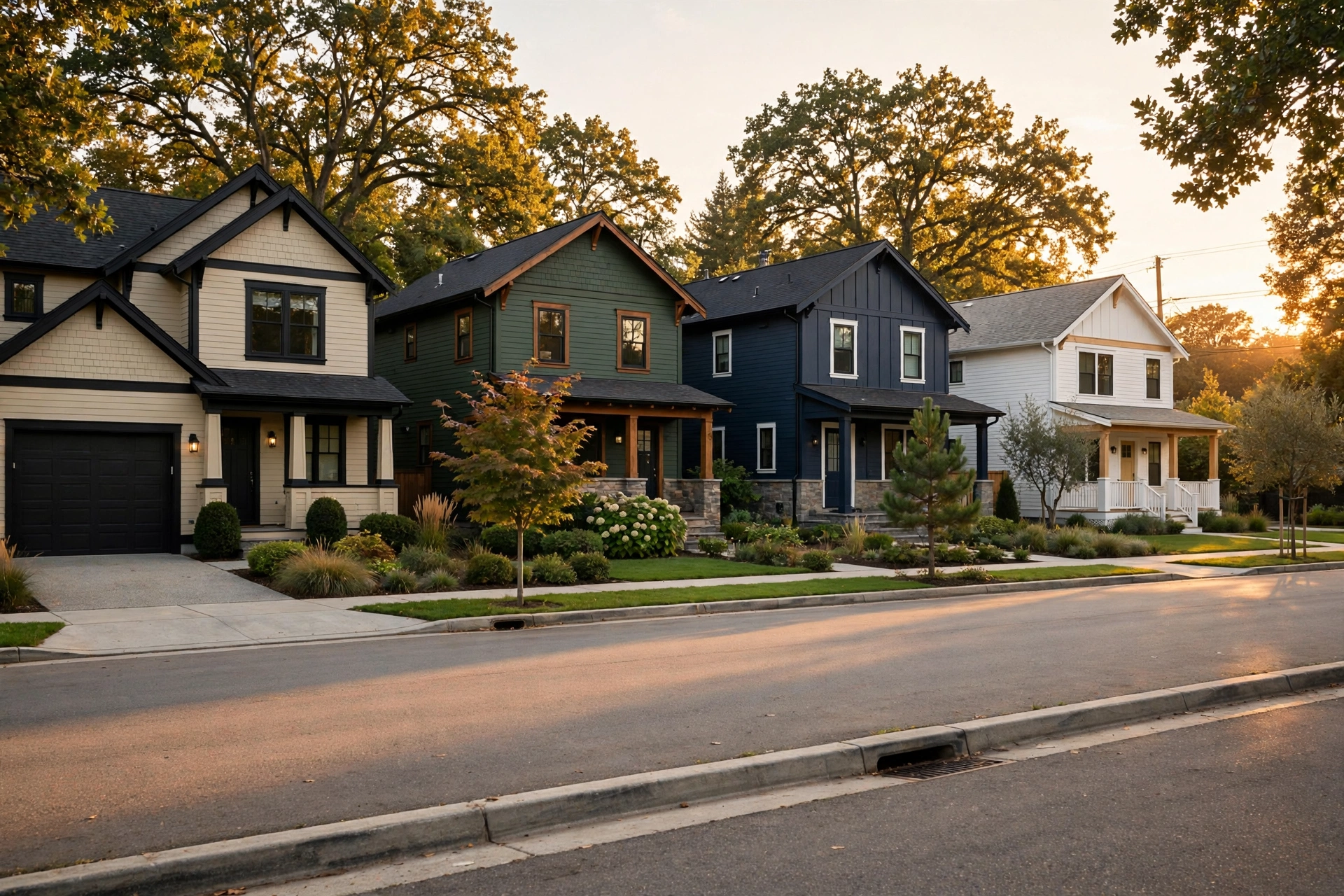
The summer we repainted our house, I learned more about color in three weekends than in ten years of decorating interiors. The swatch that looked like perfect warm greige on a paint chip turned pinkish on the north-facing wall. The navy my husband loved looked almost black by evening. And the neighbor’s “helpful” opinion changed with the weather, literally. What finally saved us was a system: big poster-board swatches, taped to all four sides of the house, lived with for a full week in sun, shade, and rain. By the end of it, choosing felt obvious instead of terrifying — and three years later, we still get compliments from strangers slowing down at the curb.
That’s the approach behind these 25 amazing exterior house color palettes for 2025. They’re built on what’s actually trending this year — warm beiges replacing stark whites, black trim having a major moment, nature-inspired greens, and front doors that refuse to be boring — plus the timeless combinations that always work. Each palette gives you the body, trim, and accent colors, why it works, and one practical tip so you don’t learn the hard way like I did.
- Warm neutrals are winning: beige and greige are replacing stark white as the go-to exterior base.
- Contrast is the 2025 story — black trim is now the most popular trim color, and 69% of homeowners choose trim that sharply contrasts the body.
- Nature-inspired greens (sage, forest, olive) and deep navy are this year’s statement colors.
- Test large swatches on all four sides of the house for a full week — sunlight changes everything.
- The front door is your one low-risk place to go bold: emerald, terracotta, or classic red.
1. Warm Beige with Black Trim
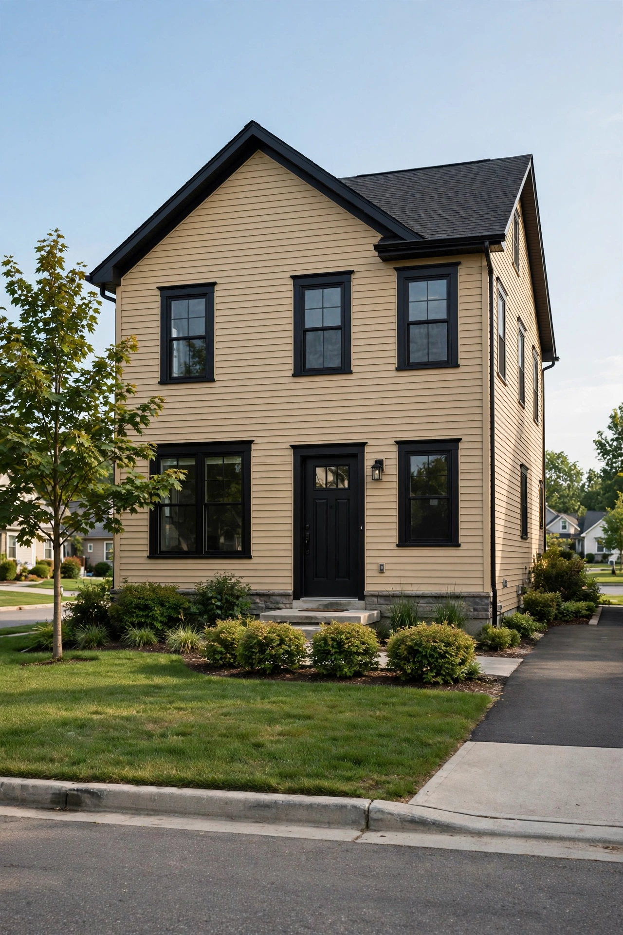
If you only remember one palette from 2025, make it this one. Warm beige siding with black trim is the breakout combination of the year — the beige keeps the house welcoming and warm, while the black trim draws crisp, confident lines around every window and door. It’s modern without being cold, classic without being boring, and it photographs beautifully for resale listings.
Try this: carry the black onto the gutters and downspouts too. Matching dark gutters makes the whole exterior look custom instead of pieced together.
Difficulty: Moderate | Cost: $3,000-$8,000
2. Deep Forest Green with Crisp White
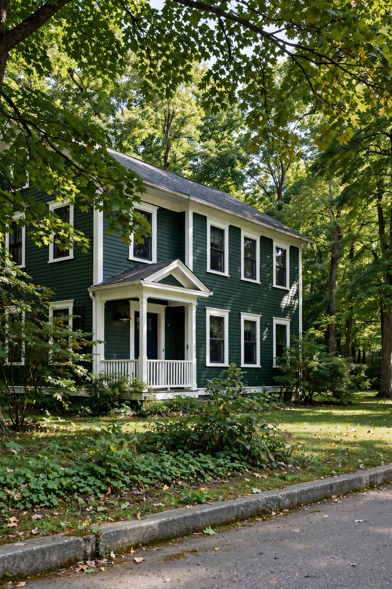
A deep forest green house feels like it grew out of the landscape — which is exactly why greens are among the most requested exterior colors this year. The richness reads timeless and a little bit stately, while crisp white trim keeps it fresh and prevents the dark body from feeling heavy. This palette shines on homes surrounded by trees, where the house and the garden start to belong to each other.
Try this: add brass or bronze fixtures and house numbers. Warm metal against deep green is one of the most expensive-looking combinations there is.
Difficulty: Moderate | Cost: $3,000-$8,000
3. Navy Blue with Bright White and a Red Door
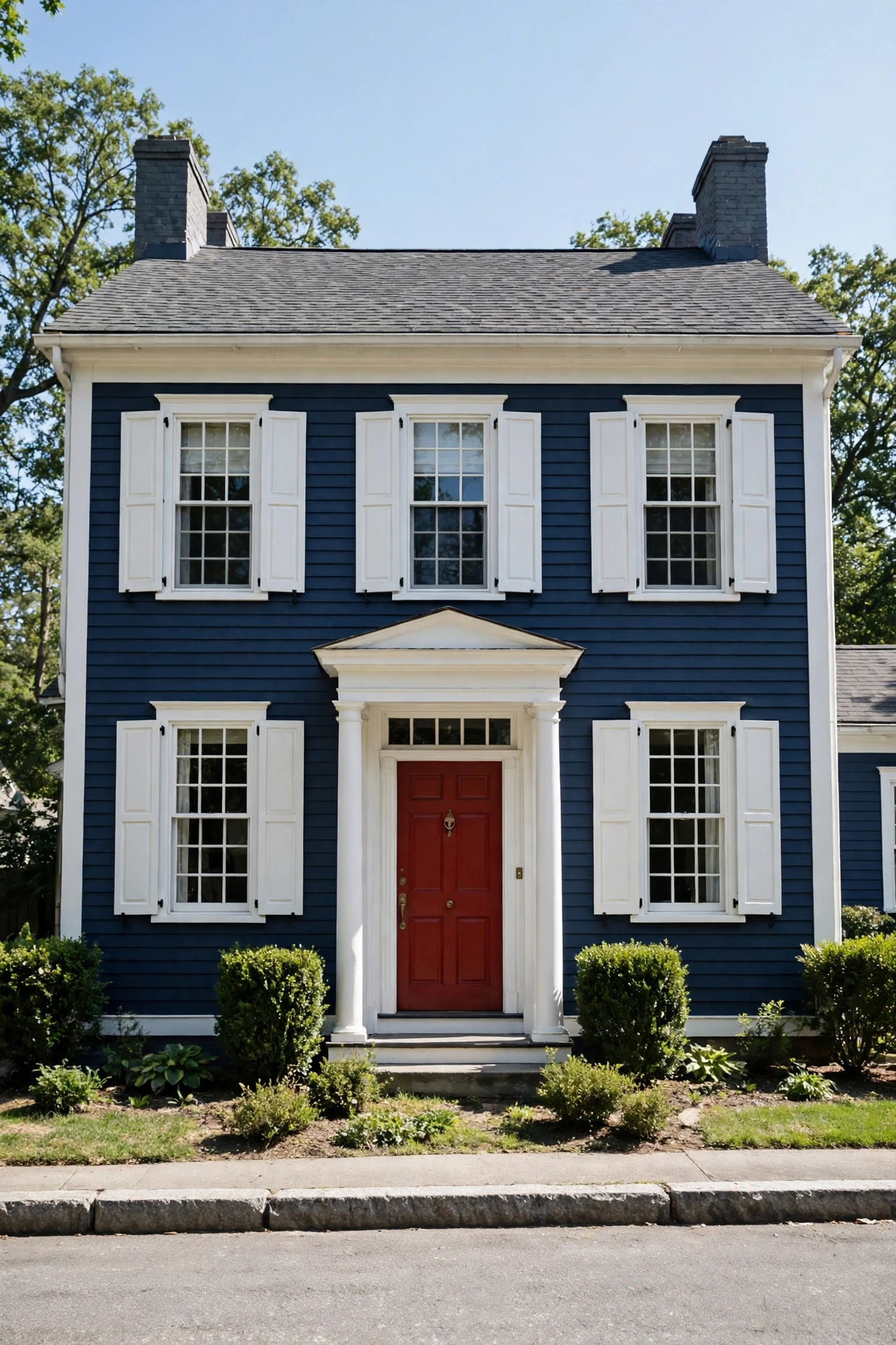
Navy and white is the perennial favorite that never really leaves — bold without being trendy, grounded without being dull. The high contrast gives the architecture real definition, and a red front door on top of it is the classic finishing move. Navy also has a practical perk: it hides dirt and weathering better than lighter colors, so it stays handsome between repaints.
Try this: paint the garage door the body color, not white. A white garage door on a navy house becomes the biggest thing anyone sees; navy lets the entrance stay the star.
Difficulty: Moderate | Cost: $3,000-$8,000
4. Warm White with Natural Wood Accents
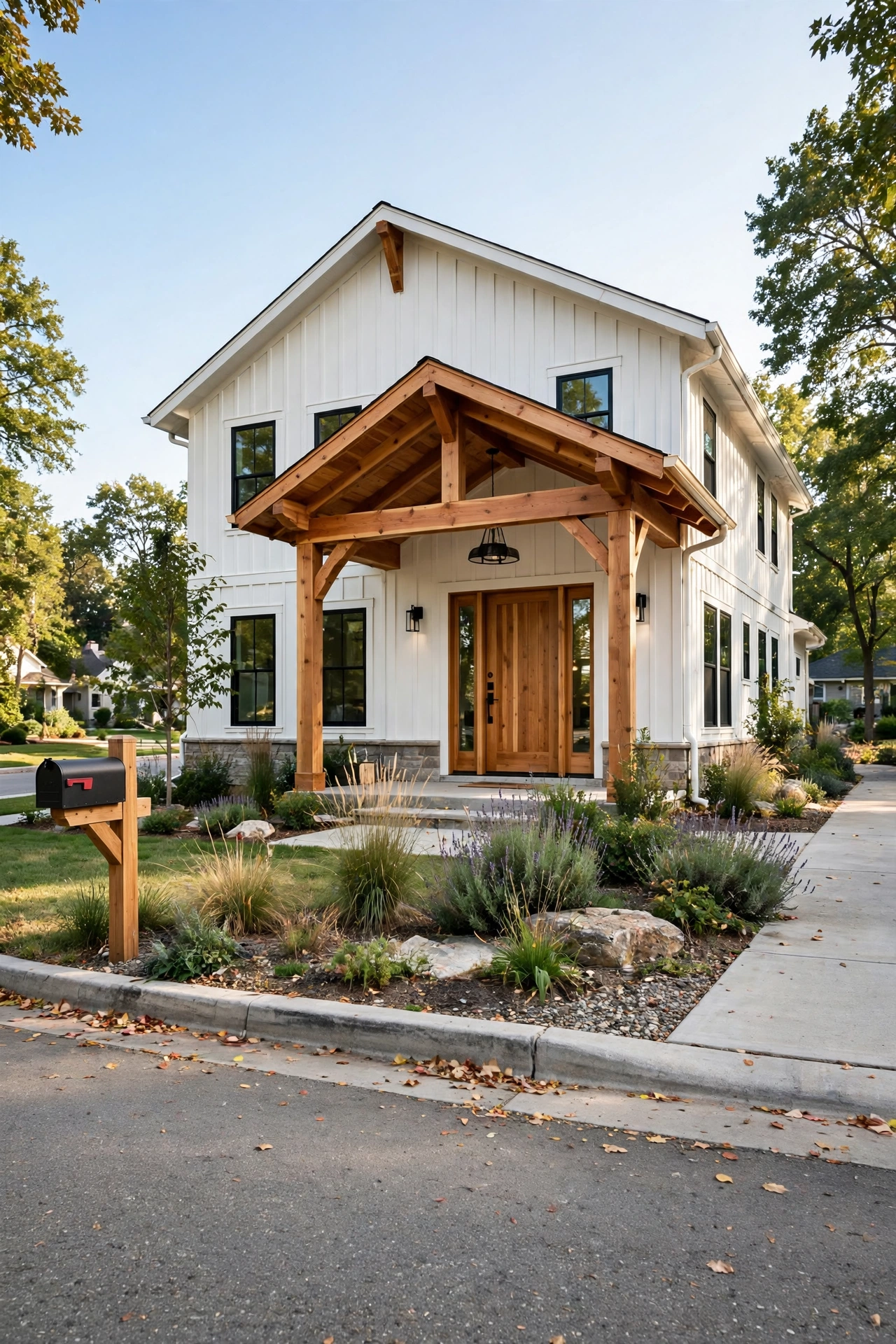
Buyers still love off-white more than any other exterior color — but in 2025, it’s all about warm whites, not stark ones. Pair a creamy warm white with natural wood on the front door, porch beams, or gable accents, and you get a look that’s clean and current but never sterile. The wood brings the warmth and texture that flat white paint can’t deliver on its own.
Try this: seal natural wood accents with a UV-protective exterior oil. Unsealed cedar goes gray within a season, and the honey tone is half the point.
Difficulty: Moderate | Cost: $3,000-$8,000
5. Charcoal Gray with Alabaster Trim
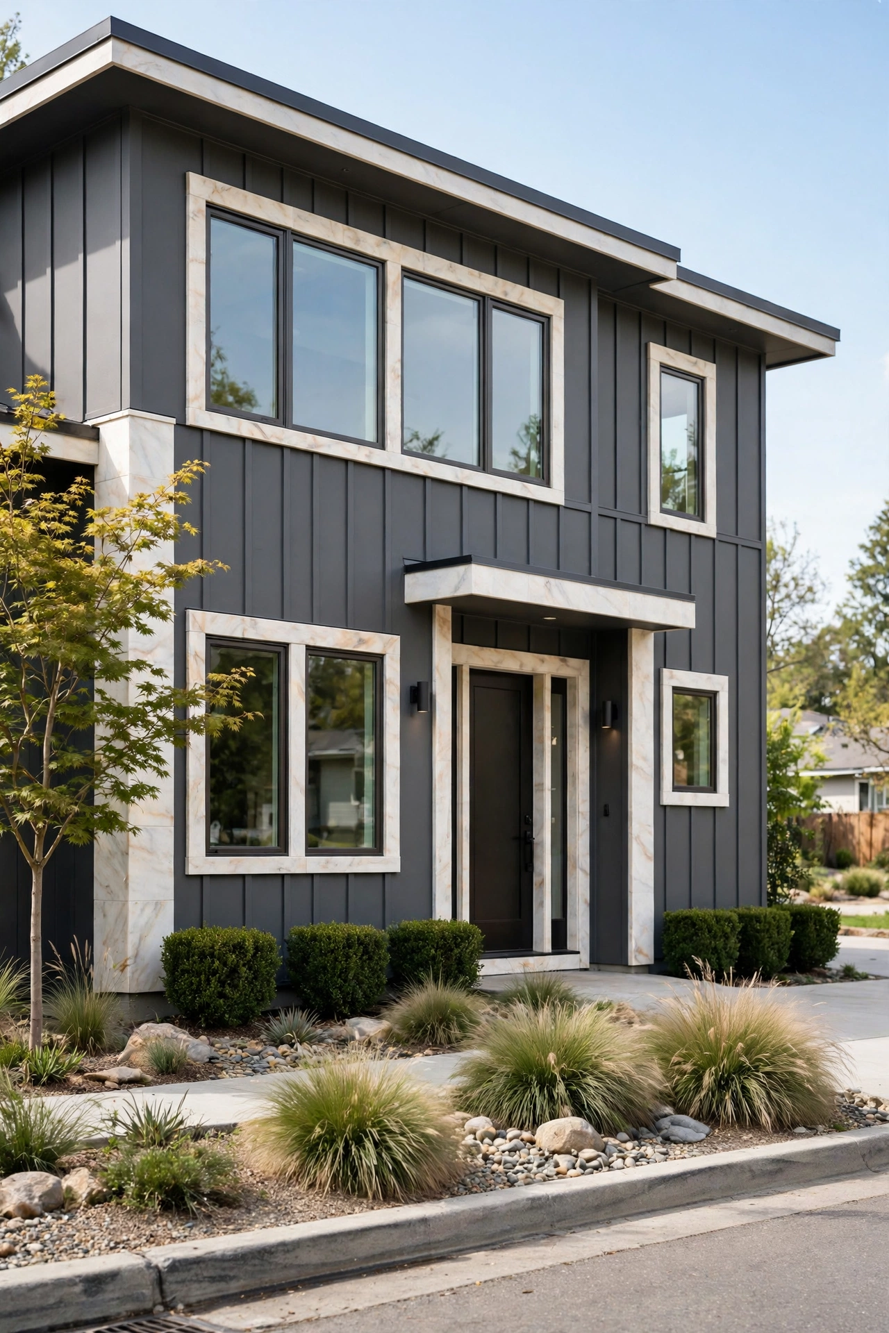
Charcoal is the dark neutral for people who find black a little too severe. It’s sleek and modern, it makes landscaping pop like a gallery wall, and paired with warm alabaster trim it never feels gloomy. This is the palette that gives a house that high-end, designer feel — the one that makes neighbors ask who the architect was.
Try this: go matte or flat on the body. Matte finishes make dark colors look richer and more expensive; gloss on dark siding shows every imperfection.
Difficulty: Moderate | Cost: $3,000-$8,000
6. Sage Green with Soft Gray Trim
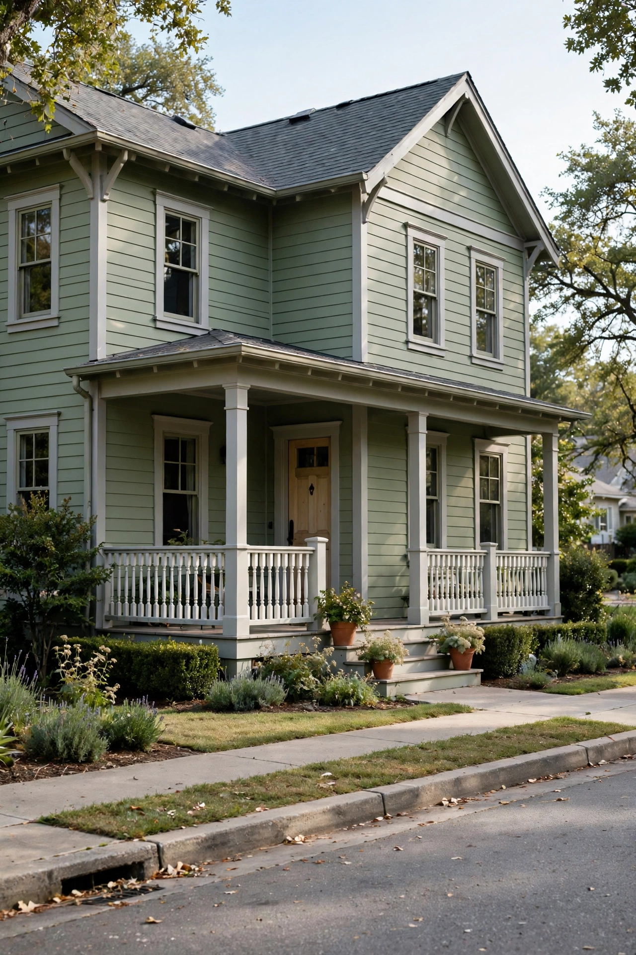
Sage green is the color equivalent of a deep breath. Muted, earthy, and endlessly calming, it’s inspired by foliage and stone — and it flatters farmhouse, cottage, and craftsman styles alike. Soft gray trim keeps the whole thing serene instead of sleepy, and the combination practically guarantees your house will look good next to any garden.
Try this: plant lavender or ornamental grasses along the foundation. Sage siding plus silvery-green landscaping is a combination that looks professionally designed.
Difficulty: Moderate | Cost: $3,000-$8,000
7. Terracotta Stucco with Warm Cream Trim
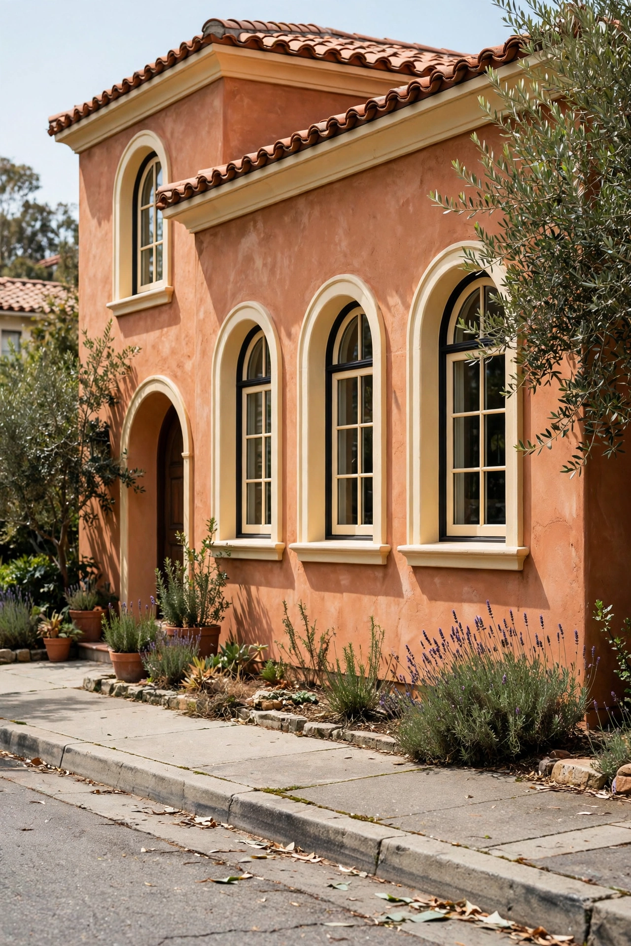
Terracotta brings instant warmth and old-world character — think sun-baked Mediterranean walls and desert Southwest charm. Paired with warm cream trim, it glows in afternoon light and feels welcoming in a way gray never will. This is also a forgiving color: it hides dust and wear far better than pale neutrals, which matters in sunny, dry climates.
If you love the sun-warmed look, these hacienda-style house ideas are full of terracotta, adobe, and courtyard inspiration that pairs perfectly with this palette.
Try this: use a slightly deeper terracotta on the front door or shutters. Tone-on-tone accents add depth without adding a new color to manage.
Difficulty: Moderate | Cost: $3,000-$8,000
8. Greige with White Trim
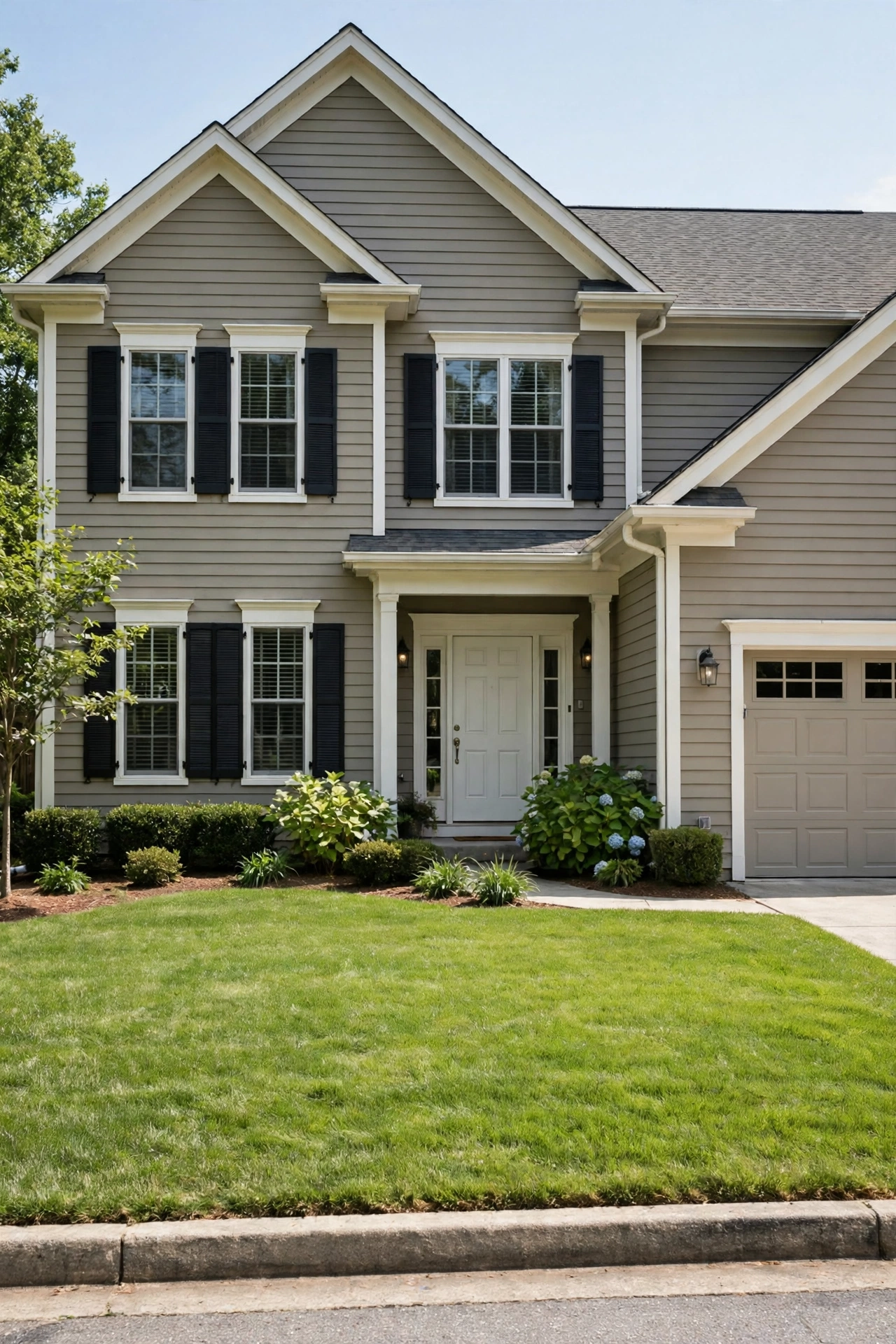
Greige — that perfect blend of gray and beige — remains the safest sophisticated choice in the book. It’s warm enough to feel inviting, neutral enough to work with any roof color, and it plays well with both traditional and modern trim details. When in doubt, greige with white trim is the palette real estate agents quietly recommend.
Try this: pick a greige with warm undertones (more beige than gray). Cool greiges can read blue or purple in certain light — the warm ones stay true.
Difficulty: Moderate | Cost: $3,000-$8,000
9. Olive Green Craftsman with Off-White Trim
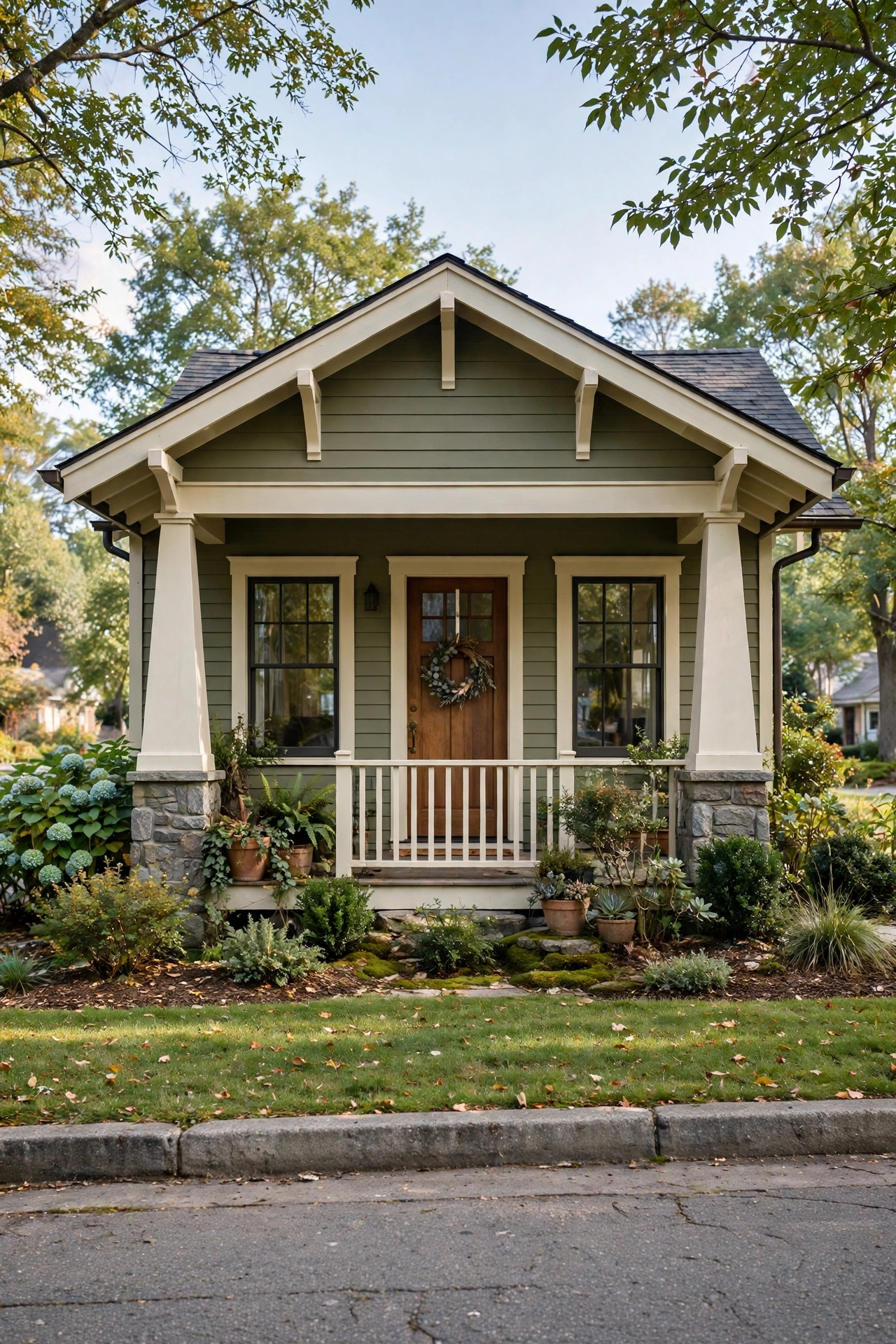
Olive green was practically made for craftsman bungalows — earthy, grounded, and rich with history. It honors the style’s arts-and-crafts roots while feeling completely current, and off-white trim softens the contrast so the deep body color feels welcoming rather than imposing. Add a natural wood or deep red door and the whole composition sings.
Try this: paint the porch ceiling a soft sky blue. It’s a classic Southern craftsman touch that keeps wasps away and looks charming doing it.
Difficulty: Moderate | Cost: $3,000-$8,000
10. Sky Blue Coastal with Creamy White
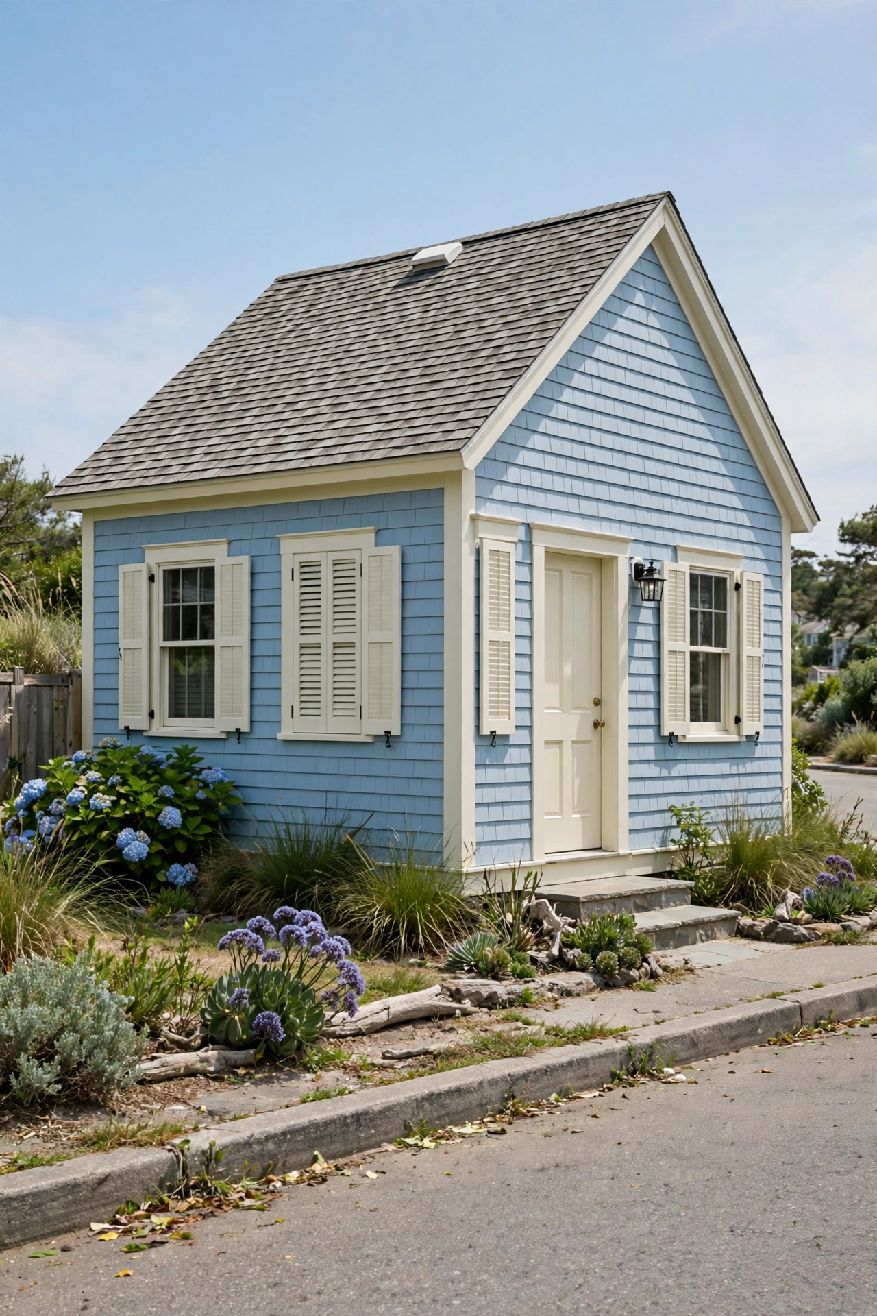
Serene sky blue with creamy white trim is the coastal cottage dream — fresh, breezy, and instantly relaxing. It echoes water and sunlight, which is why it works even hundreds of miles from the ocean. Keep the trim creamy rather than bright white; the warmth keeps the blue from feeling chilly.
Try this: add white railings and a natural wood deck or steps. The trio of blue, cream, and wood is coastal curb appeal in its purest form.
Difficulty: Moderate | Cost: $3,000-$8,000
11. Rich Plum Door on Warm Beige
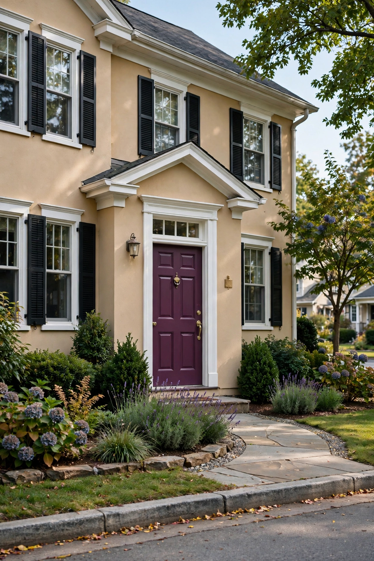
Here’s the 2025 power move for commitment-phobes: keep the house a safe, warm beige and let the front door do all the talking. A rich plum — deep, wine-like, a little bit dramatic — turns an ordinary entrance into a focal point. It’s the kind of bold that costs one quart of paint and an afternoon, and if you hate it, you’re out almost nothing.
Try this: echo the plum in a planter or two by the door. Repeating the accent color makes it look intentional instead of random.
Difficulty: Easy | Cost: $150-$600
12. Cedar Brown with Cream Trim
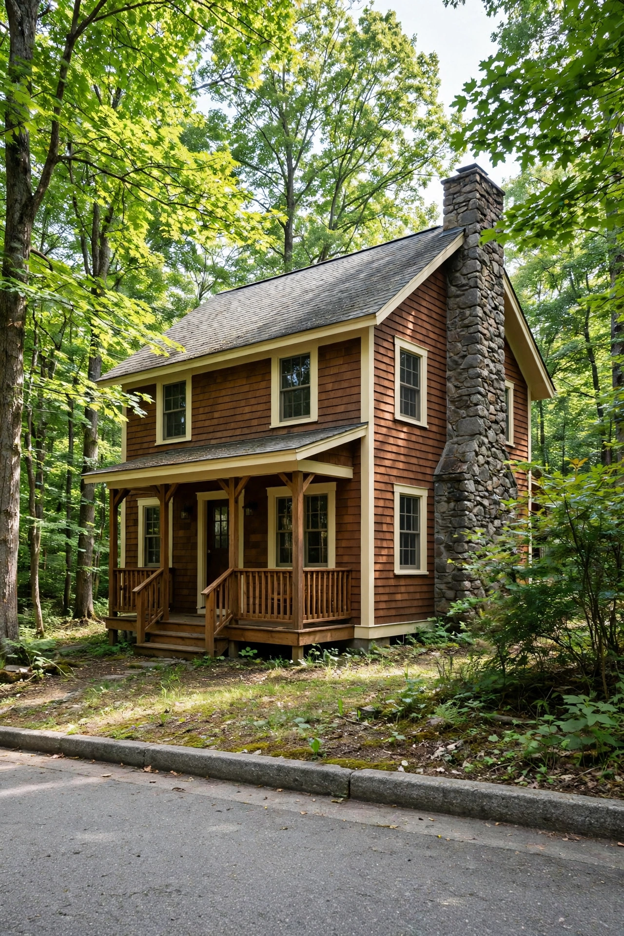
Cedar brown grounds a house in the landscape like nothing else — it mimics earthy soils and bark, so the home feels settled rather than placed. Cream trim lifts it and keeps the deep body color from going cave-like. This is the palette for wooded lots, mountain cabins, and anyone who wants their house to feel like it belongs to the land.
Try this: stain rather than paint if you have real wood siding. Stain lets the grain show through and weathers more gracefully than paint.
Difficulty: Moderate | Cost: $3,000-$8,000
13. Soft Black Modern with White Trim
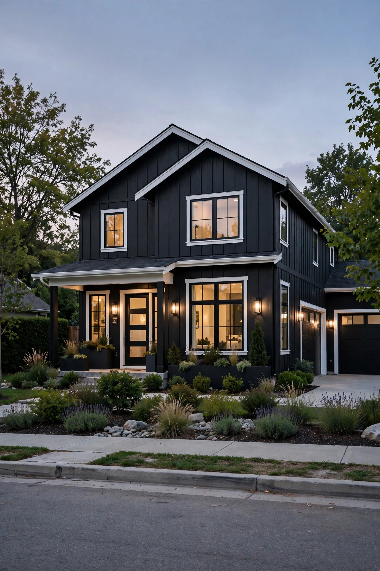
Black houses have gone from shocking to sought-after, and “soft black” — a black with warm undertones — is the most livable version. It’s dramatic, it’s modern, and it makes every other house on the street look a little plain by comparison. White trim is non-negotiable here: it’s what keeps the black architectural instead of ominous.
Try this: invest in landscape lighting. A black house at night can disappear; well-placed lights make it glow like a lantern. These hidden lighting ideas for a cozy home include outdoor tricks that make dark exteriors look magical after sunset.
Difficulty: Moderate | Cost: $3,000-$8,000
14. Pastel Blue with Charcoal Shutters
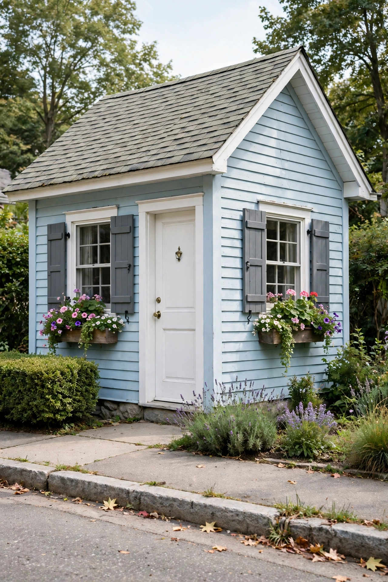
Pastels are quietly making a comeback on exteriors — and pastel blue with charcoal shutters is the grown-up way to do it. The soft blue keeps things light and friendly while the deep charcoal shutters add the contrast and definition that keep pastels from feeling washed out. Add flower boxes and you’ve got storybook curb appeal.
Try this: keep the roof in mind — pastel blue loves a gray or charcoal roof and fights with brown ones.
Difficulty: Moderate | Cost: $3,000-$8,000
15. Cream Farmhouse with Forest Green Shutters
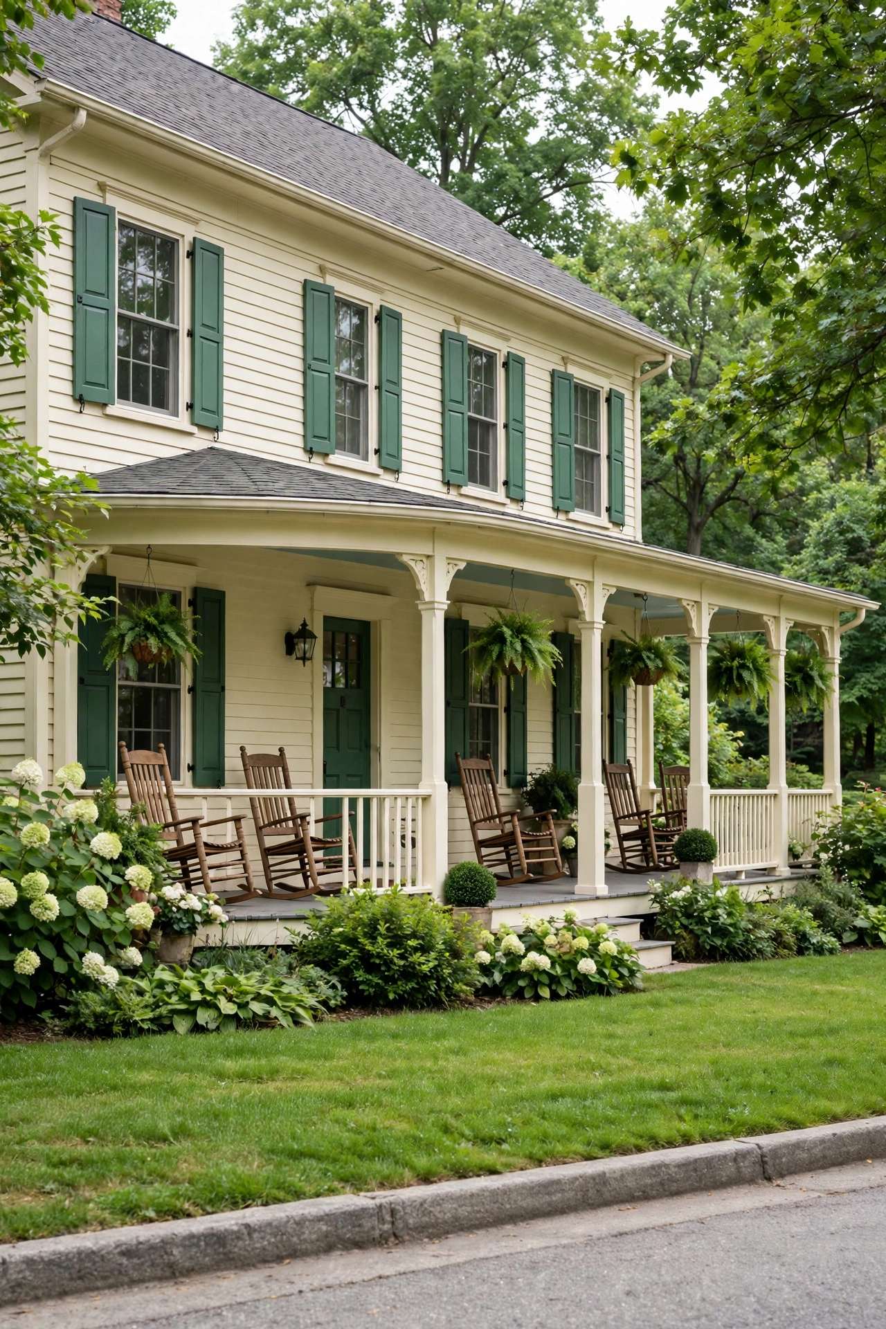
Cream siding, forest green shutters, white porch railing — this is the farmhouse palette that launched a thousand Pinterest boards, and it still works. The cream is warmer and more forgiving than pure white, the green shutters add that classic pop, and the whole thing reads “home” from a block away. Some classics are classics for a reason.
Try this: paint the shutters the same forest green as the front door. Matching door and shutters is the oldest trick in the farmhouse book.
Difficulty: Moderate | Cost: $3,000-$8,000
16. Warm Taupe with Cream and Charcoal
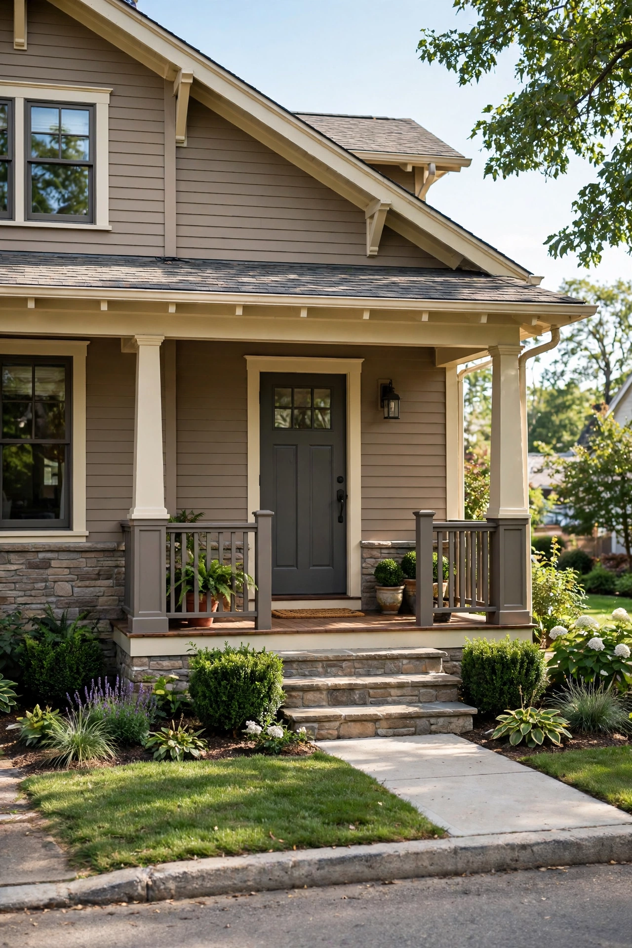
Warm taupe is the earthy neutral that feels like a hug — cozy, grounded, and endlessly versatile. Layering it with cream trim and a charcoal front door gives you a three-color palette with real depth: light, medium, and dark working together. It’s a favorite for craftsman and rustic styles, where the colors echo natural wood and stone.
Try this: use the charcoal on the front door and house numbers only. A little dark goes a long way; too much and the taupe loses its warmth.
Difficulty: Moderate | Cost: $3,000-$8,000
17. Classic Brick Red with White and Black
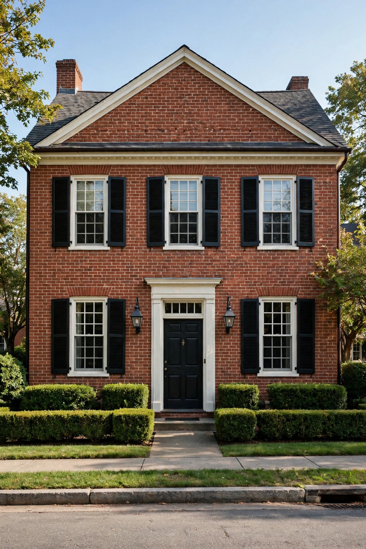
You don’t paint brick red — you were lucky enough to be born with it — but you absolutely get to choose what goes with it. White trim keeps it crisp and traditional, black shutters and a black door add the tailored contrast that makes brick look intentional rather than inherited. It’s the most timeless palette on this list, and it will still look right in thirty years.
Try this: never paint brick on a whim — it’s nearly irreversible. Work with it using trim, shutters, and door color instead.
Difficulty: Moderate | Cost: $3,000-$8,000
18. Slate Gray with White Trim and a Mustard Door
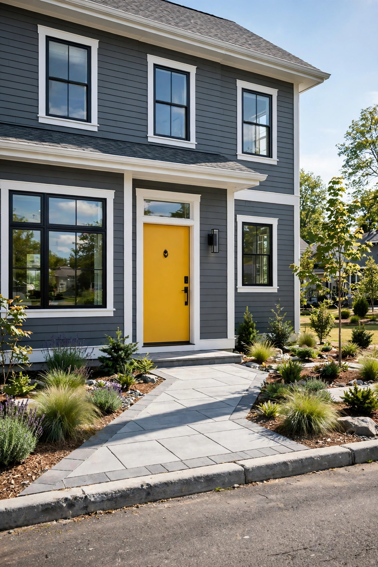
Slate gray is the sophisticated middle ground — cooler than greige, softer than charcoal. With white trim it reads clean and modern, and then the mustard door walks in and steals the show. Yellow doors are having a real moment, and against slate gray the combination is equal parts cheerful and chic.
Try this: a bold door needs a clear sightline. Trim back any bushes blocking the entrance — the door is the star, so give it a stage.
Difficulty: Moderate | Cost: $3,000-$8,000
19. Butter Yellow with Soft Gray Trim
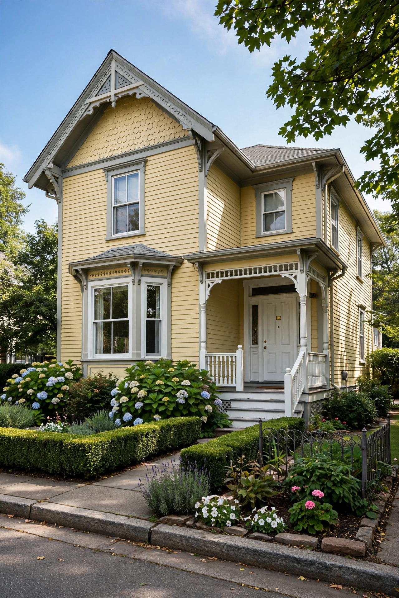
Butter yellow is sunshine you can live in — warm, welcoming, and impossible to drive past without smiling. Soft gray trim keeps it sophisticated instead of saccharine, and white porch details add the crispness. This palette loves Victorian and cottage architecture, where the ornamental trim gives the yellow plenty of places to show off.
Try this: go one shade deeper than the chip you love. Yellow always dries lighter and brighter than expected — the “too bold” chip is usually the right one.
Difficulty: Moderate | Cost: $3,000-$8,000
20. Sea Salt Green-Blue with White Trim
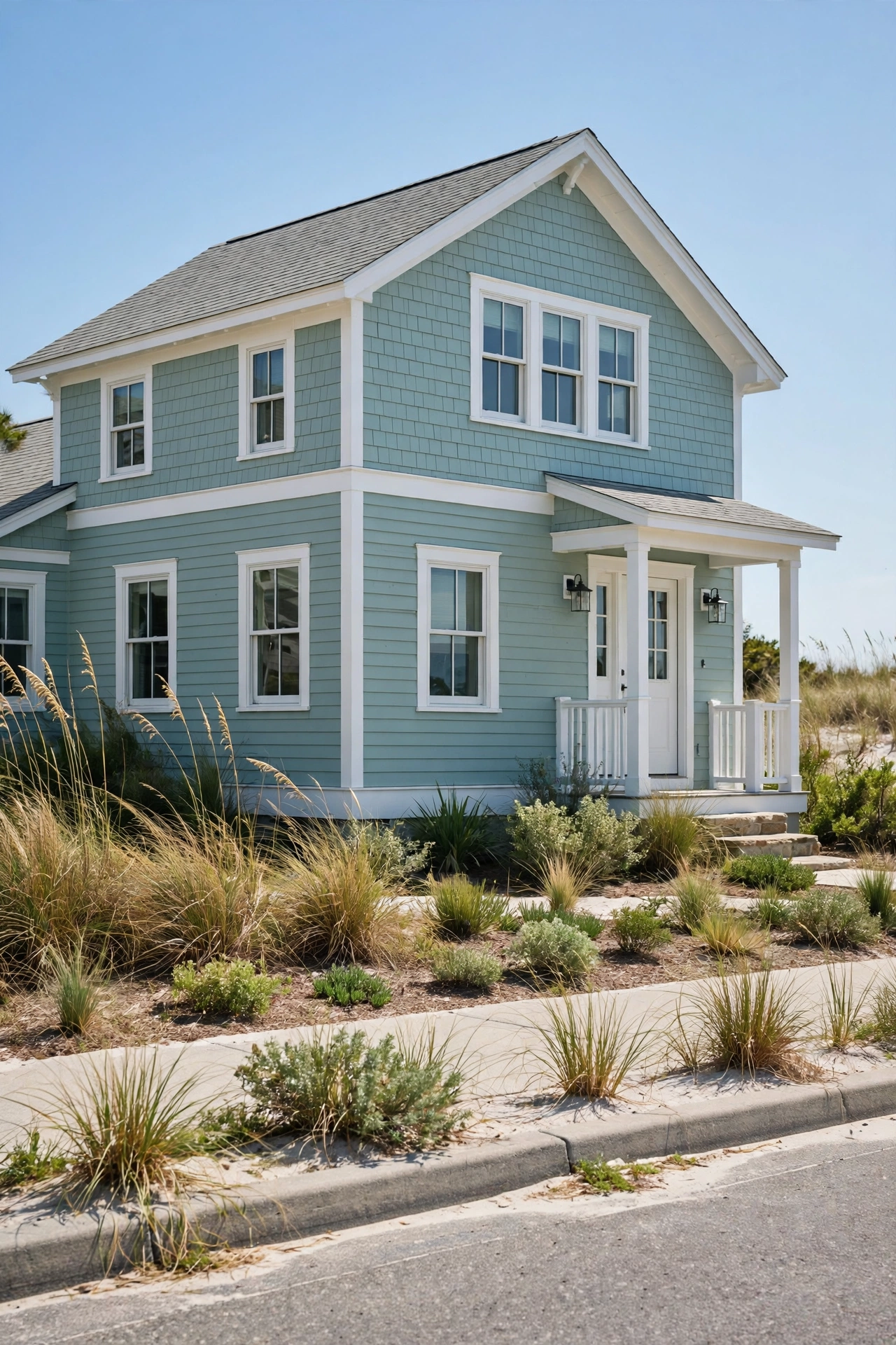
That soft green-blue that shifts with the light — part sea, part sage — is one of the most beloved exterior colors of the decade. It’s fresh and calming without being cold, and white trim makes it glow. It works on beach houses, obviously, but it’s equally lovely on a suburban colonial that wants a little personality.
Try this: this color changes dramatically between morning and evening light. It’s the number-one candidate for the full-week swatch test — don’t skip it.
Difficulty: Moderate | Cost: $3,000-$8,000
21. Dark Bronze with Natural Stone
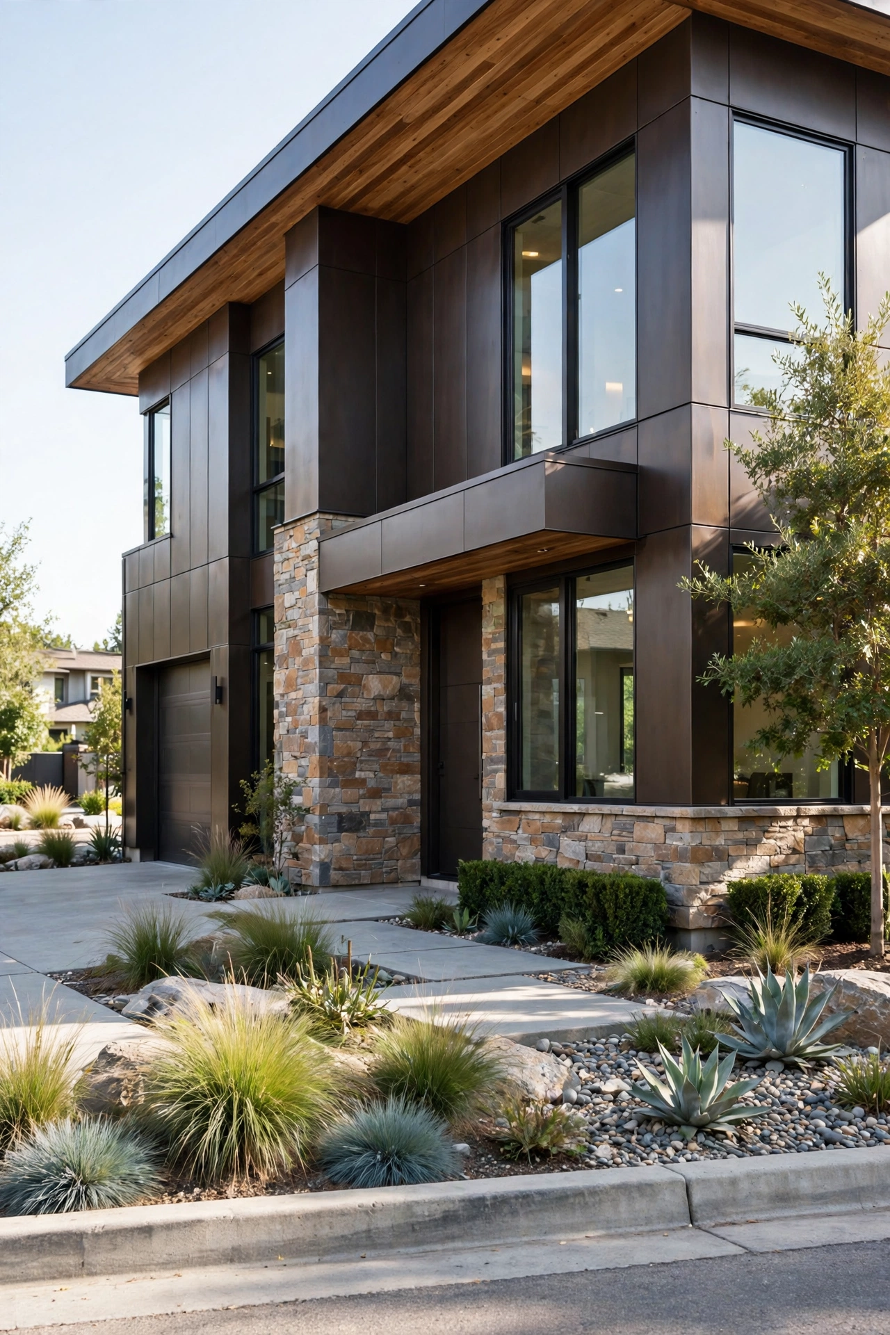
Dark bronze siding paired with natural stone is the palette for modern homes that want warmth with their edge. The bronze has a richness flat black can’t match — it shifts subtly in different light — and the stone adds texture and permanence. Wood soffits or a wood door complete the material story. It’s the most “architect-designed” look on this list.
Try this: keep the stone to one or two features (entry tower, foundation, chimney). Stone everywhere gets expensive and busy; stone as an accent looks deliberate.
Difficulty: Moderate | Cost: $3,000-$8,000
22. Pale Lavender with Deep Navy Trim
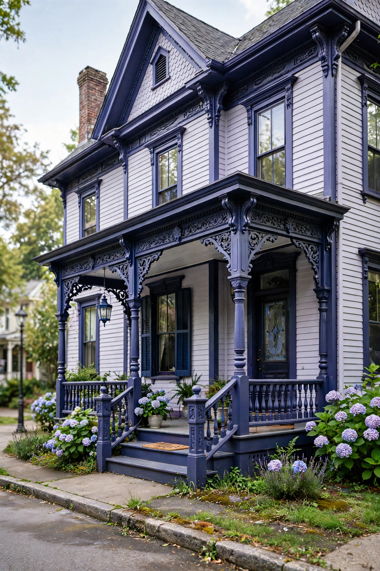
Pale lavender is the wildcard — unexpected, romantic, and absolutely unforgettable on the right house. Deep navy trim gives it the backbone it needs, turning what could be sweet into something sophisticated. This palette belongs on Victorians and cottages with ornamental details, where the two colors can play across gingerbread trim and turned porch posts.
Try this: check your HOA or historic district rules before falling in love. Unusual colors are the most likely to need approval — get it in writing first.
Difficulty: Moderate | Cost: $3,000-$8,000
23. Clay Brown Ranch with Warm White Trim
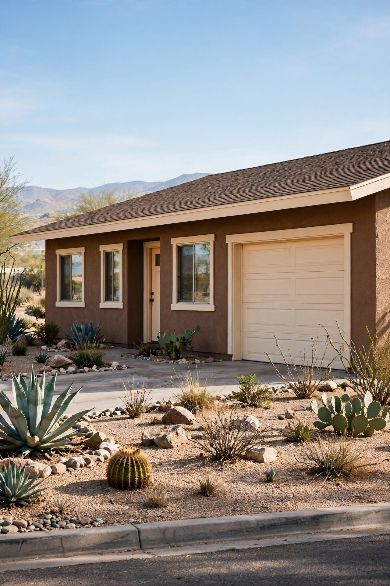
Clay brown is the honest, hardworking color of ranch houses — earthy, unpretentious, and perfectly at home in desert and prairie landscapes. Warm white trim keeps it from feeling flat, and the combination handles harsh sun beautifully. It’s not trying to be trendy, which is exactly why it never looks dated.
Try this: in hot climates, lighter body colors reflect heat and cut cooling costs. Clay brown is about as dark as you want to go in the desert Southwest.
Difficulty: Moderate | Cost: $3,000-$8,000
24. Blue-Gray Coastal Cottage with White Trim
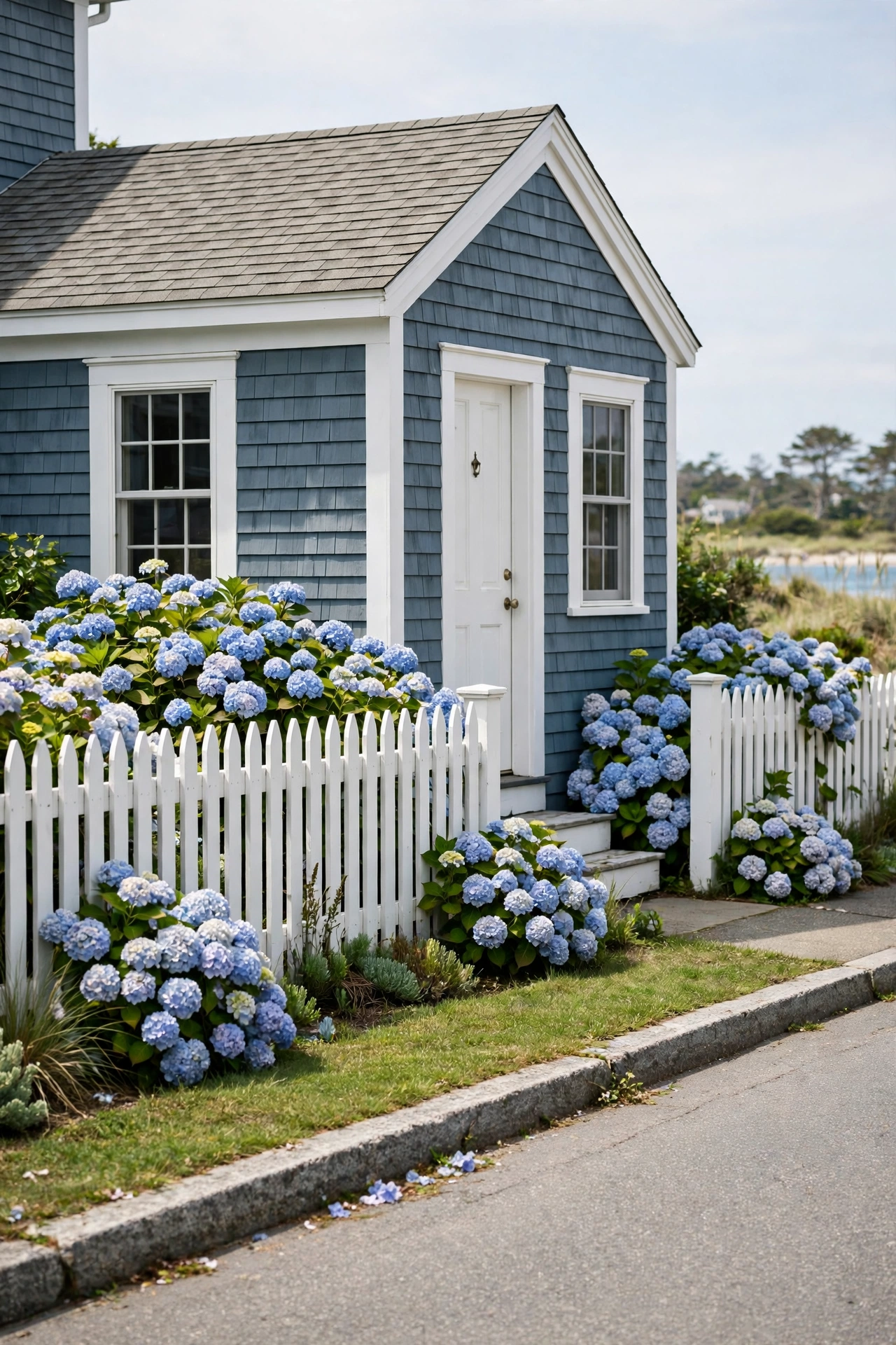
Blue-gray is the color of fog over water — moody, coastal, and effortlessly elegant. With white trim it’s the classic New England cottage look, and it pairs beautifully with hydrangeas, weathered wood, and white picket fences. It’s a touch more sophisticated than sky blue, for people who want coastal without the theme-park feel.
Try this: a weathered-wood or driftwood-gray front door completes the look. Match the door to beach finds, not to the trim.
Difficulty: Moderate | Cost: $3,000-$8,000
25. Off-White with an Emerald Green Door
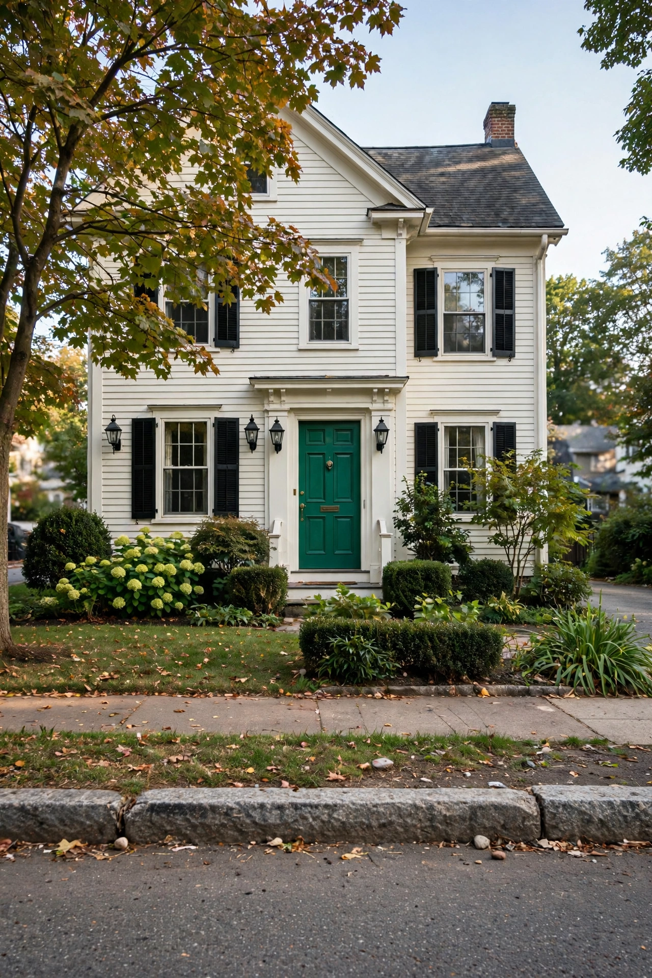
Off-white houses are the blank canvas of exteriors — and an emerald green door is the boldest, most jewel-like brushstroke you can put on one. Emerald reads luxurious and a little bit daring, and against off-white siding it practically glows. Black lanterns and dark hardware finish the composition. If your house is already a neutral, this is the single highest-impact change you can make.
Try this: paint the door in high-gloss or semi-gloss. Deep colors look richest with a little sheen — flat emerald falls flat.
Difficulty: Easy | Cost: $150-$600
Quick-Pick Cheat Sheet
Not sure where to start? Match your goal to the right palette:
| Your Goal | The Palette | Why It Wins | Best For |
|---|---|---|---|
| Most on-trend for 2025 | Warm beige + black trim | The year’s breakout combo — warm yet defined | Suburban two-stories |
| Safest for resale | Greige + white trim | Pleases everyone, works with any roof | Any style |
| Biggest drama | Soft black + white trim | Designer feel, unforgettable curb appeal | Any style |
| Cheapest transformation | Keep the body, paint the door | One quart of emerald or plum changes everything | Neutral houses |
| Most timeless | Navy + white + red door | Classic for decades, hides wear well | Colonials |
| Warmest and coziest | Terracotta + warm cream | Sun-baked warmth, hides dust | Mediterranean, ranch |
Frequently Asked Questions
What is the most popular exterior house color for 2025?
Warm neutrals are leading the year — warm beige, greige, and creamy off-whites top the lists, with beige notably replacing stark white as the freshest choice. Off-white remains the single most attractive color to buyers, while natural wood siding and dark gray round out the most-wanted looks.
What exterior paint colors add the most curb appeal?
High-contrast combinations add the most curb appeal: a light body with dark trim (or vice versa) makes architecture pop from the street. Off-white bodies, warm beiges, navy, and dark gray consistently rank highest with buyers, and a bold front door in emerald, red, or terracotta gives the whole facade a focal point.
Should exterior trim be lighter or darker than the house color?
Either works — what matters is contrast. Most homeowners now choose trim that sharply contrasts the body, with black emerging as the most popular trim color. Light bodies want dark trim for definition; dark bodies want light trim to keep them from feeling heavy. Low-contrast, tone-on-tone trim looks flat by comparison.
How do I test exterior paint colors before committing?
Paint large swatches on poster boards and tape them to all four sides of the house, then live with them for a full week. Check them in morning sun, afternoon glare, evening shade, and after rain — colors shift dramatically with light and direction. North-facing walls read cooler than south-facing ones, so never judge from one wall alone.
What front door color works best with a neutral house?
Almost anything — that’s the beauty of a neutral house. Emerald green and deep red are timeless showstoppers, terracotta and mustard yellow are very 2025, and black is the safe-but-sharp choice. Pick a finish with some sheen (satin or semi-gloss) so the color looks rich rather than flat.
Final Thoughts
Here’s what three weekends of repainting taught me: the right exterior color doesn’t just change how your house looks — it changes how you feel pulling into the driveway. We went with warm greige and white trim (with a deep red door, because some classics are non-negotiable), and every time I come home, the house looks like it was expecting me. Start with the swatch test — big boards, all four sides, a full week. It’s the least glamorous step and the most important one. Then pick the palette that made you catch your breath a little when you imagined it. For a deeper dive into specific paint combinations and expert application tips, this Sherwin-Williams’ residential exterior palettes is worth reading before you buy a single gallon. And if your home’s style leans farmhouse, these shiplap accent wall ideas for beginners pair beautifully with the board-and-batten textures that make exterior palettes like cream-and-forest-green sing. For even more color inspiration, this Benjamin Moore’s modern farmhouse palette covers trending shades by architectural style.


