


Standing in the paint aisle with a Sherwin Williams fan deck in your hands is a strange kind of pressure. There are more than a thousand shades, and the white that looked clean on the card can turn yellow by lamplight or gray by morning. Picking a wall color feels small until you have painted four walls and have to live with the mistake.
This guide narrows the field to 20 elegant Sherwin Williams wall colors, grouped by color family, with each shade’s undertone, best room, and a trim color that pairs with it. It is written for homeowners repainting a room or a whole house who want a calm, polished result without a designer. I painted one hallway wall in Agreeable Gray last spring and lived with it for a week before touching the rest of the house, and that week of looking saved me from a second paint job.
Quick takeaways
- Test a sample on two walls and check it in morning light and evening lamplight before buying gallons.
- Undertone matters more than the color name. Gray, beige, green, or pink shows up once the paint dries.
- Pale whites and greiges suit most rooms. Dark colors work best on one accent wall or in rooms with strong daylight.
- Pair each wall color with a named trim white so the whole room reads as planned.
- In homes built before 1978, check for lead paint before sanding or scraping old walls.

1. Alabaster (SW 7008): a warm white for living rooms
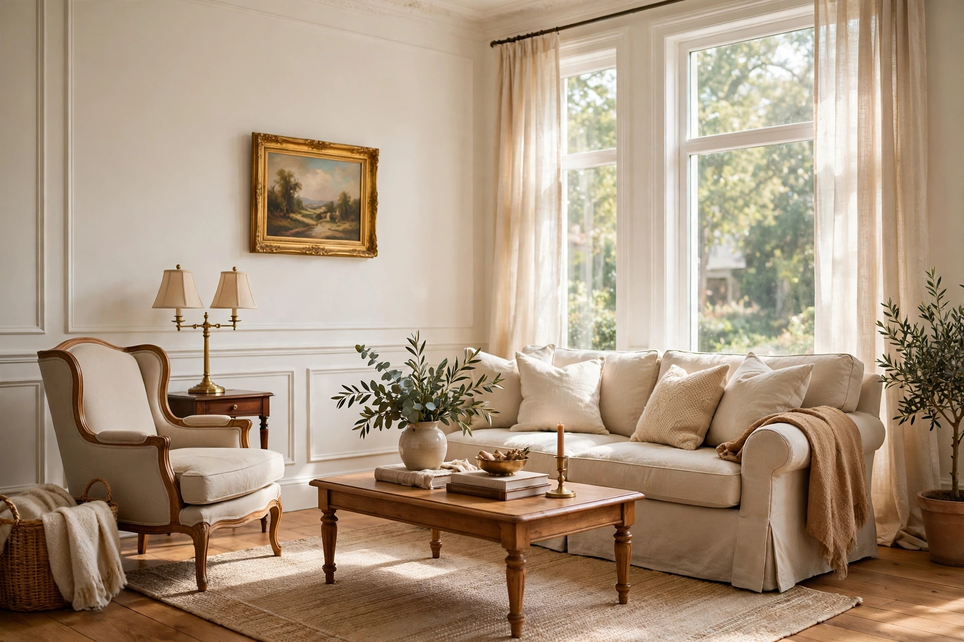
Alabaster is a soft warm white with a slight beige pull, and it stays gentle in rooms that get mixed light. It suits living rooms where you want brightness without a cold, stark feeling, and it sits well with oak floors, linen sofas, and brass lamps. Use Pure White on the trim for a quiet contrast that keeps the walls looking warm rather than yellow. It also works on kitchen cabinets when the rest of the kitchen stays light. Sample it next to your floor, since warm wood pulls out its cream side.
Try this: Paint one wall first and view it at night under your regular lamps, since Alabaster warms up fast in artificial light.
Cost: $$| Difficulty: Easy

2. Pure White (SW 7005): a crisp white for bedrooms
Pure White reads clean and bright, with just enough warmth to keep it from looking icy. It is a strong pick for bedrooms where white bedding and light wood need a backdrop that does not compete. It also works on trim and doors throughout the house, which gives you one white that ties rooms together. In north-facing rooms, add warm wood and cream textiles so the white does not feel chilly. Keep the finish in eggshell on walls and satin on trim for a subtle shift between surfaces.
Try this: Hold the sample against your bedding and curtains, since cool fabrics can push Pure White toward gray.
Cost: $$| Difficulty: Easy
3. Snowbound (SW 7004): a cool white for baths and kitchens
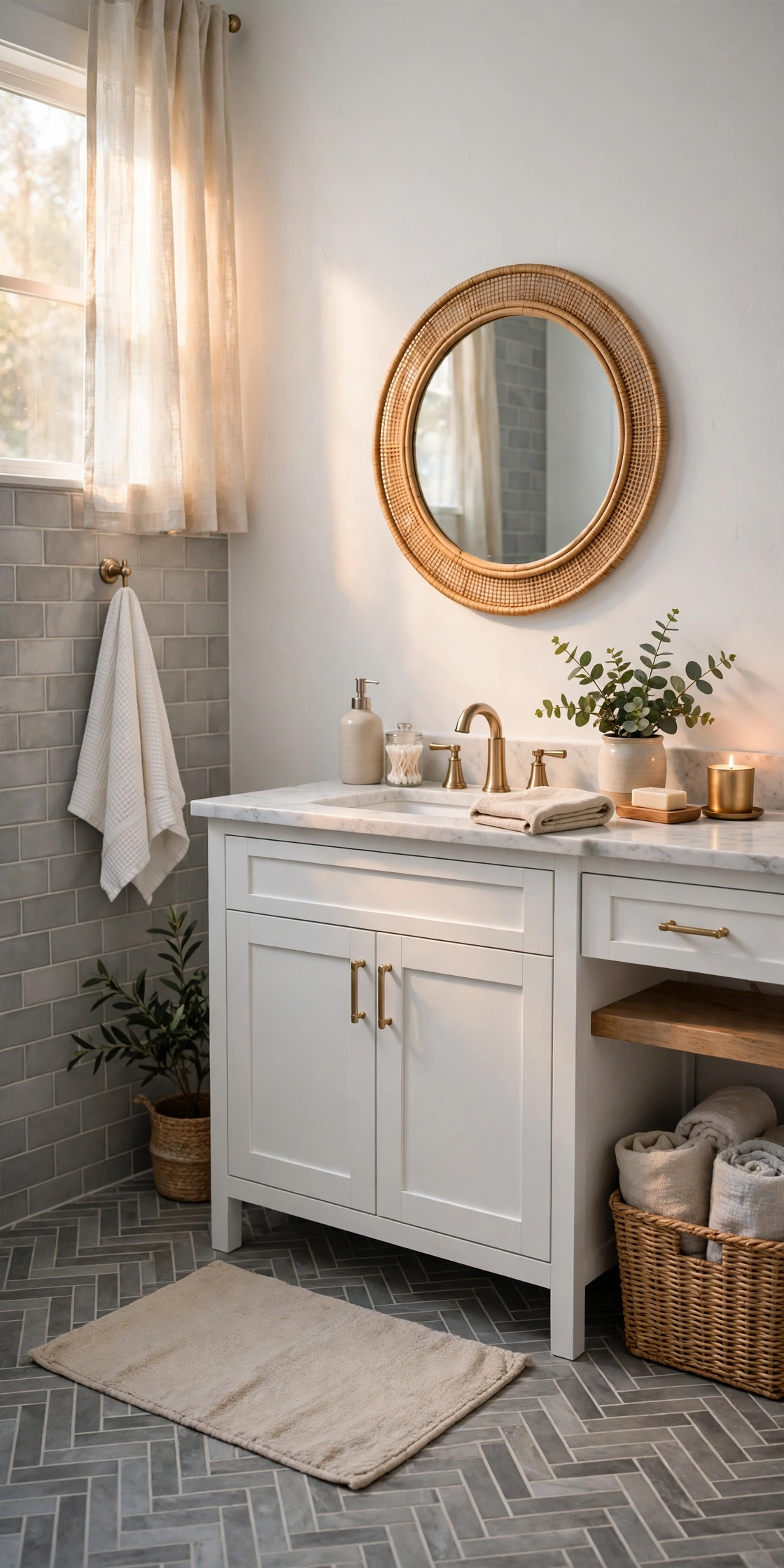
Snowbound is a cool-leaning white with a faint gray undertone, and it pairs naturally with gray tile, marble, and chrome fixtures. It suits bathrooms and kitchens where you want a fresh, clean backdrop that still reads as white. In rooms with warm wood, it can pick up a slight greige cast, so check it beside your cabinets before committing. It works as a whole-room color in small baths, where its cool tone keeps the space feeling open. Use it with Pure White trim only if you want a soft, low-contrast edge.
Try this: Sample it next to your tile and countertop, since cool whites shift the most beside stone.
Cost: $$| Difficulty: Easy

4. Greek Villa (SW 7551): a creamy white for kitchens
Greek Villa is a creamy white with a soft yellow pull that warms a kitchen without turning gold. It suits rooms with wood cabinets, butcher block, and warm metals, where a crisper white would feel harsh. Away from other bright whites it reads as a clean neutral, but beside a stark white it shows its warmth, so keep trim in the same family. It also works in dining rooms with warm wood tables and cream chairs. Two coats over a white primer give the most even result on previously dark walls.
Try this: Paint the sample beside your cabinet door, not on a white card, so you see the real contrast.
Cost: $$| Difficulty: Easy

5. Agreeable Gray (SW 7029): a greige for the whole house
Agreeable Gray is a warm greige with a beige undertone, and it has stayed popular because it gets along with both warm wood and cool gray furniture. It suits whole-house color schemes, where one shade needs to flow from a living room into a hallway and a bedroom without clashing. It reads gray in cool light and beige in warm light, which is why a sample on two walls matters. Pair it with Alabaster trim for a soft edge, or Pure White trim for more definition. It covers well in two coats over a similar tone.
Try this: Carry the sample board from room to room at midday, since Agreeable Gray changes with each room’s light.
Cost: $$| Difficulty: Easy
6. Repose Gray (SW 7015): a cooler greige for bedrooms
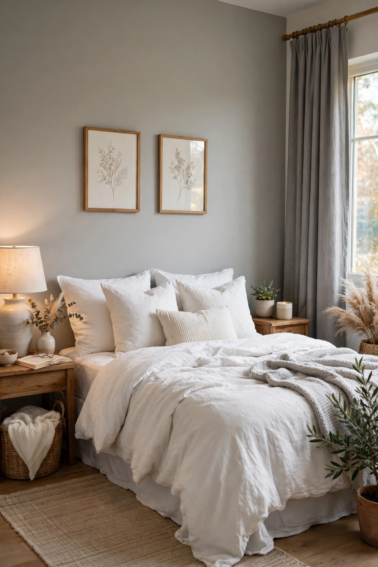
Repose Gray sits on the cooler side of greige, with a faint blue undertone that keeps it calm in bedrooms. It suits rooms with white bedding, gray curtains, and cool metals, where a warmer greige would feel heavy. It also works in home offices, where its quiet tone stays in the background. In south-facing rooms it warms up a little, which makes it a safe pick when you are unsure about light direction. Pair it with Pure White trim and keep bedding simple so the wall color carries the room.
Try this: Check the sample beside any blue or gray fabric in the room, since cool textiles pull out its blue side.
Cost: $$| Difficulty: Easy
7. Accessible Beige (SW 7036): a beige for open-plan rooms
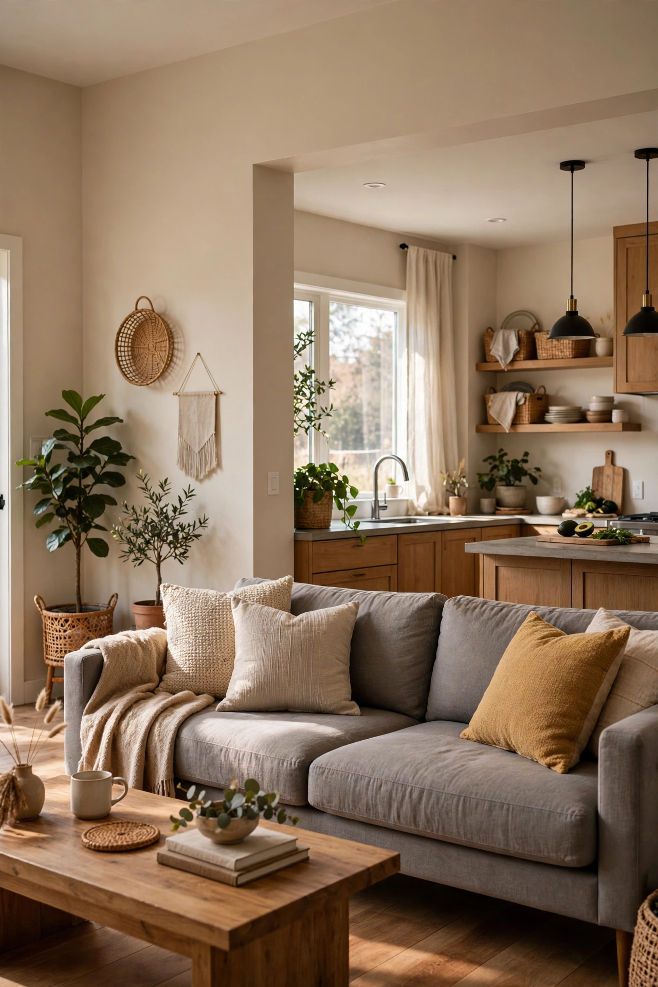
Accessible Beige is a mid-tone beige with enough gray to keep it current, and it handles open-plan rooms well because it bridges warm wood floors and a gray sofa in one shade. It suits living and dining spaces that share walls, where a stronger color would chop the space into pieces. It has no orange or pink pull, which keeps it from dating the room. Pair it with Alabaster trim and warm wood, and keep large furniture in muted tones so the walls stay the calm layer. It needs two coats for even coverage over white primer.
Try this: Paint a wide test patch where the living area meets the dining area, since that joint shows the color at its hardest.
Cost: $$| Difficulty: Easy
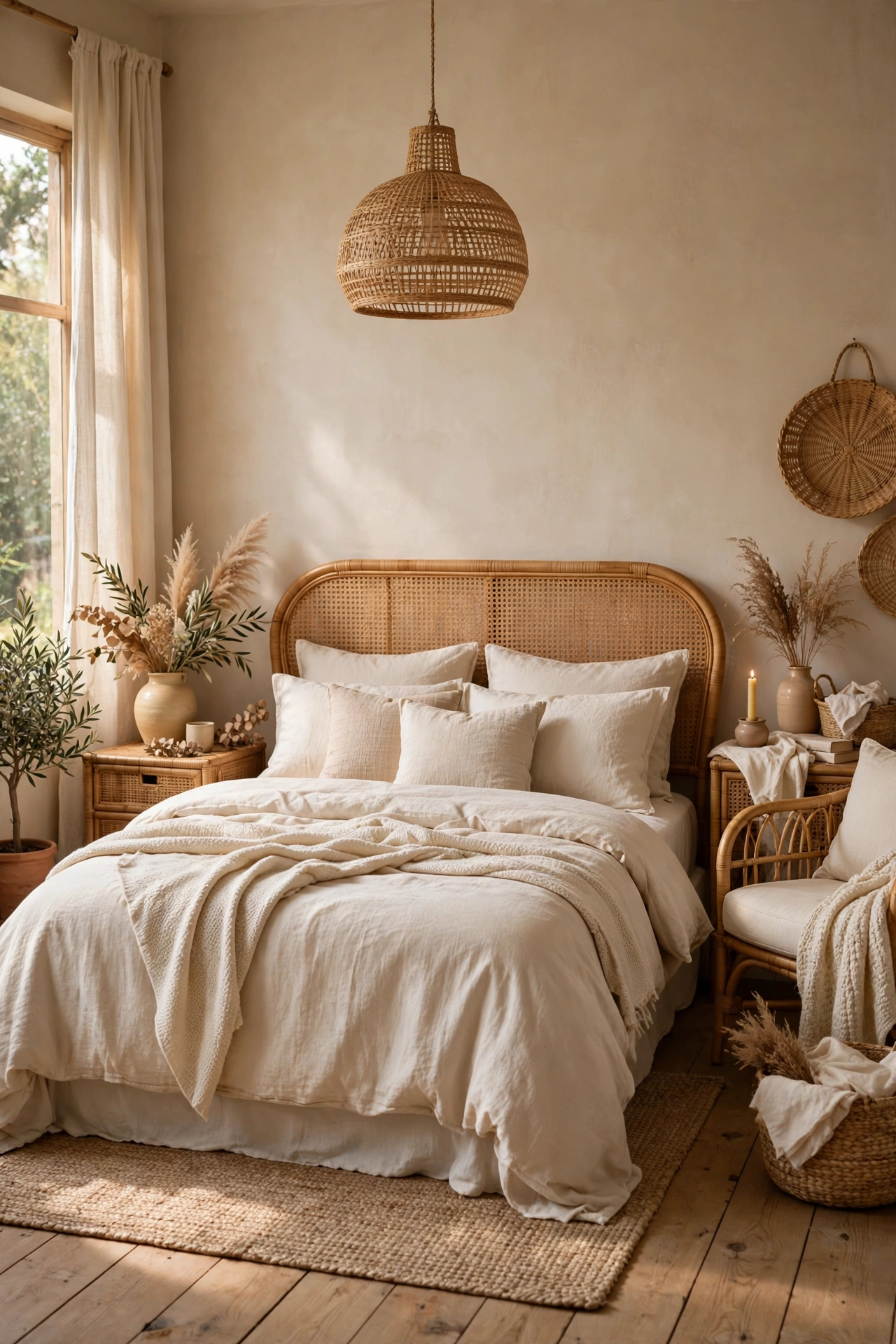
8. Natural Linen (SW 9109): a sandy beige for bedrooms
Natural Linen is a breezy beige with greige undertones that feels light for a beige, and it suits bedrooms where you want warmth without weight. It pairs with light wood, rattan, and cream bedding, and it stays soft in morning light. It also works in guest rooms, where a gentle neutral welcomes different tastes. In rooms with little daylight, add white trim and pale bedding so the beige does not darken the corners. It is a good pick when Agreeable Gray feels too gray and Accessible Beige feels too deep.
Try this: Sample it on the wall opposite the window, which is where beige reads darkest.
Cost: $$| Difficulty: Easy

9. Sea Salt (SW 6204): a green gray for bathrooms
Sea Salt is a muted green with gray and blue undertones, and it gives bathrooms a calm, coastal feel without turning mint. It suits rooms with white tile, a wood vanity, and chrome or brushed nickel fixtures. It reads cooler in north light, so sun-rich bathrooms show its softest side. Use a satin or semi-gloss finish in a bath, since walls near showers need a washable surface. Pair it with Pure White trim and keep towels in white or sand so the green stays the quiet note in the room.
Try this: Hold the sample against your tile grout, since gray grout can push Sea Salt toward blue.
Cost: $$| Difficulty: Easy

10. Evergreen Fog (SW 9130): a sage green for bedrooms and offices
Evergreen Fog blends green and gray into a sage that shifts with the light, reading greener by day and grayer at night. It suits bedrooms and home offices where you want color that still feels restful, and it pairs with natural wood and brass. Use it on all four walls in a bedroom for a cocooned feel, or on one accent wall behind a desk in an office. It works with cream bedding and linen curtains, and it keeps a room feeling grounded without going dark. Two coats give the truest version of the shade.
Try this: View the sample at dusk, since Evergreen Fog changes more between day and evening than most neutrals.
Cost: $$| Difficulty: Easy
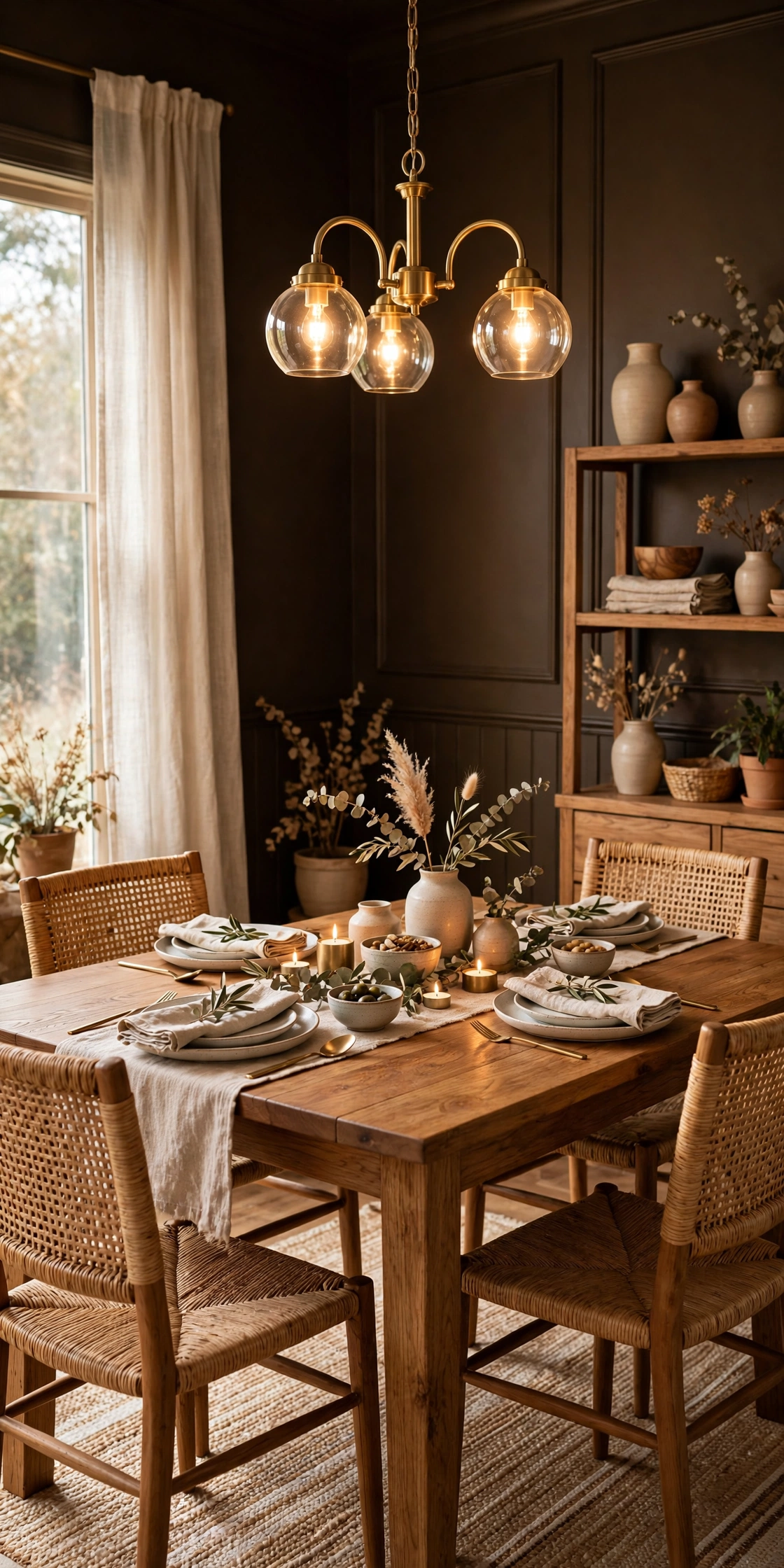
11. Urbane Bronze (SW 7048): a dark bronze gray for dining rooms
Urbane Bronze is a deep brown gray rooted in warm earth tones, and it gives a dining room a grounded, evening-ready mood. It suits one accent wall behind a sideboard, or a small dining room where dark walls make the table the focus. Pair it with warm wood, layered textiles, and brass lighting, and keep the other walls in a pale warm white so the room does not close in. It also works on built-in shelves, where its depth makes books and dishes stand out. Use it in rooms with decent daylight or strong lamps.
Try this: Paint the accent wall first and live with it through one dinner before deciding on a second dark wall.
Cost: $$| Difficulty: Easy
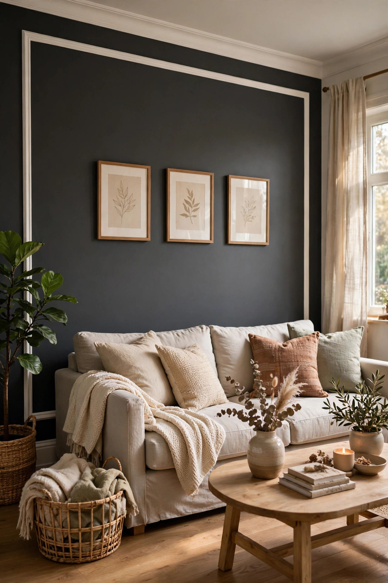
12. Iron Ore (SW 7069): a charcoal for doors and accent walls
Iron Ore is a deep charcoal gray with a cool depth, and it works best where you use it with restraint. It suits a front door, interior doors, or one accent wall in a well-lit room, where its darkness reads as crisp rather than heavy. It pairs with white trim, light sofas, and black hardware for a sharp, tailored edge. On kitchen cabinets it gives a strong, current look, but keep the walls pale so the room stays balanced. It covers best over a gray-tinted primer, which cuts the coat count on dark applications.
Try this: Paint a door before a wall, since a door shows you the color at a smaller, safer scale.
Cost: $$| Difficulty: Easy

13. Naval (SW 6244): a navy for offices and dining rooms
Naval is a deep navy with cool gray undertones, and it suits home offices and dining rooms where a little drama helps the room. It reads as a true navy in daylight and softens toward slate in the evening, which makes it a good pick for rooms used after dark. Pair it with gold or brass accents, white trim, and warm wood to keep the navy from feeling cold. In a study, use it on the wall behind the desk so video calls get a clean, dark backdrop. Keep ceilings white to hold the room’s height.
Try this: Test it on the wall you face most, since navy reads darker on walls you look at head-on.
Cost: $$| Difficulty: Easy

14. Tricorn Black (SW 6258): a true black for libraries
Tricorn Black is a true black with no strong undertone pull, and it suits a library wall, built-in shelves, or a small powder room where bold color earns its keep. It pairs with white trim and pale shelves for a classic contrast, and it makes art and books pop against a dark field. Use it on one wall or on cabinetry rather than a whole small room, and keep the lighting warm so the black reads rich instead of flat. It needs a dark-tinted primer for even coverage, and two finish coats for a smooth result.
Try this: Paint the back of a bookshelf first, since that small area shows how black behaves in your light.
Cost: $$| Difficulty: Easy to moderate
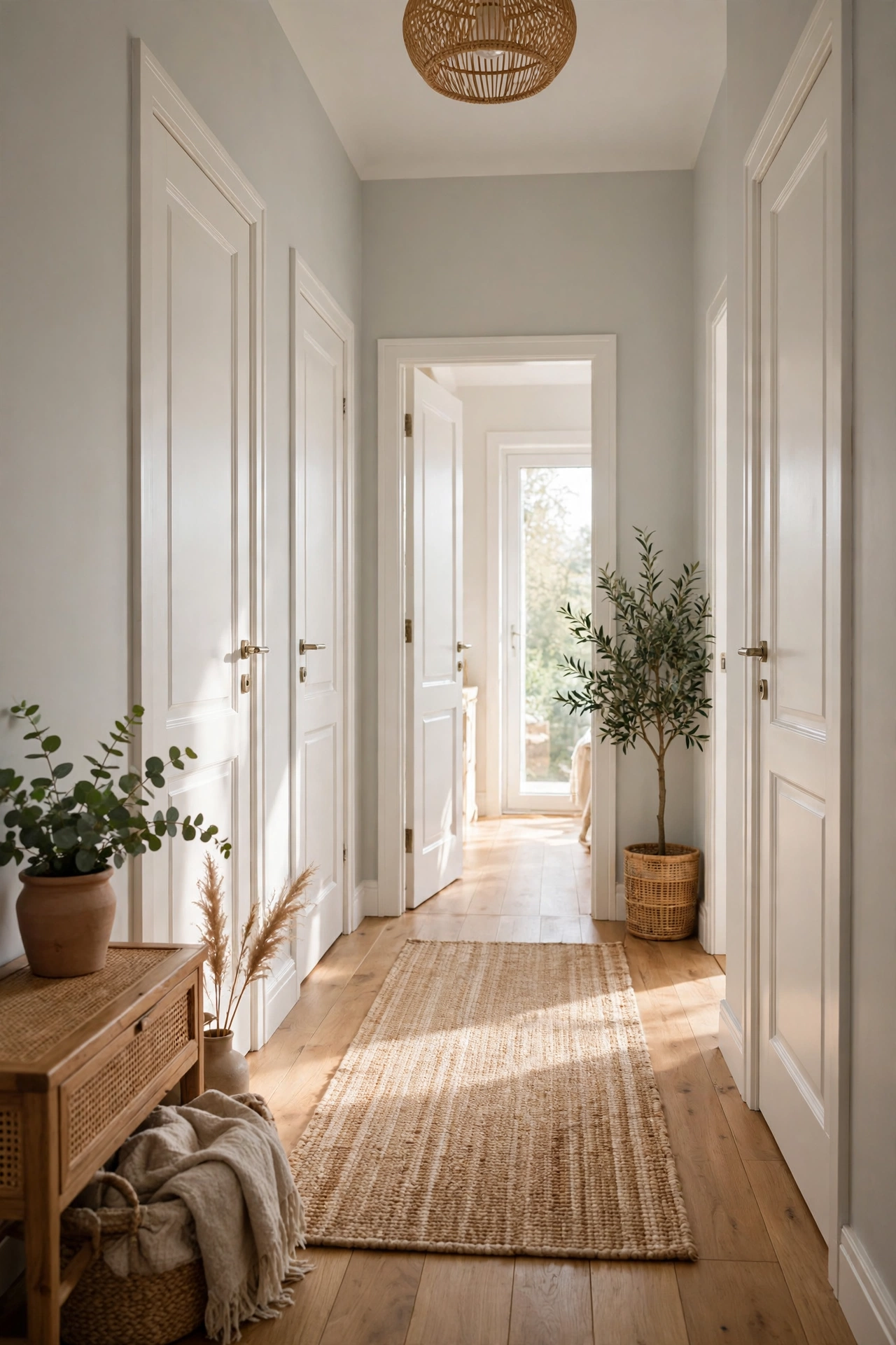
15. Drift of Mist (SW 9166): a pale gray for low-light rooms
Drift of Mist is a soft, airy gray with a faint green hint, and it suits hallways and rooms with little natural light because it never reads dark. It pairs with white trim and cream accents, and it keeps a dim room feeling open rather than shadowed. It works as a whole-house pale neutral when you want more presence than a white but less weight than a greige. In rooms with warm wood it leans warmer, and in rooms with gray furniture it leans cooler, so it adapts to what is already there. Sample it in the darkest corner of the room.
Try this: Check it at night with lamps on, since pale grays can wash out under cool bulbs.
Cost: $$| Difficulty: Easy

16. Shoji White (SW 7042): a warm off-white for hallways
Shoji White is a warm off-white with a beige base and a gray pull, and it suits hallways and living rooms where you want more depth than a plain white. It stands out against white trim, which gives hallways a gentle layered look, and it pairs with warm wood and cream textiles. In some light it shows a faint pink hint, so sample it beside your floor and trim before painting a full hallway. It also works in bedrooms that need warmth without a yellow cast. Keep the finish in eggshell so hallway scuffs wipe off.
Try this: Run the sample along a full hallway wall, since long walls show undertone shifts better than a small patch.
Cost: $$| Difficulty: Easy
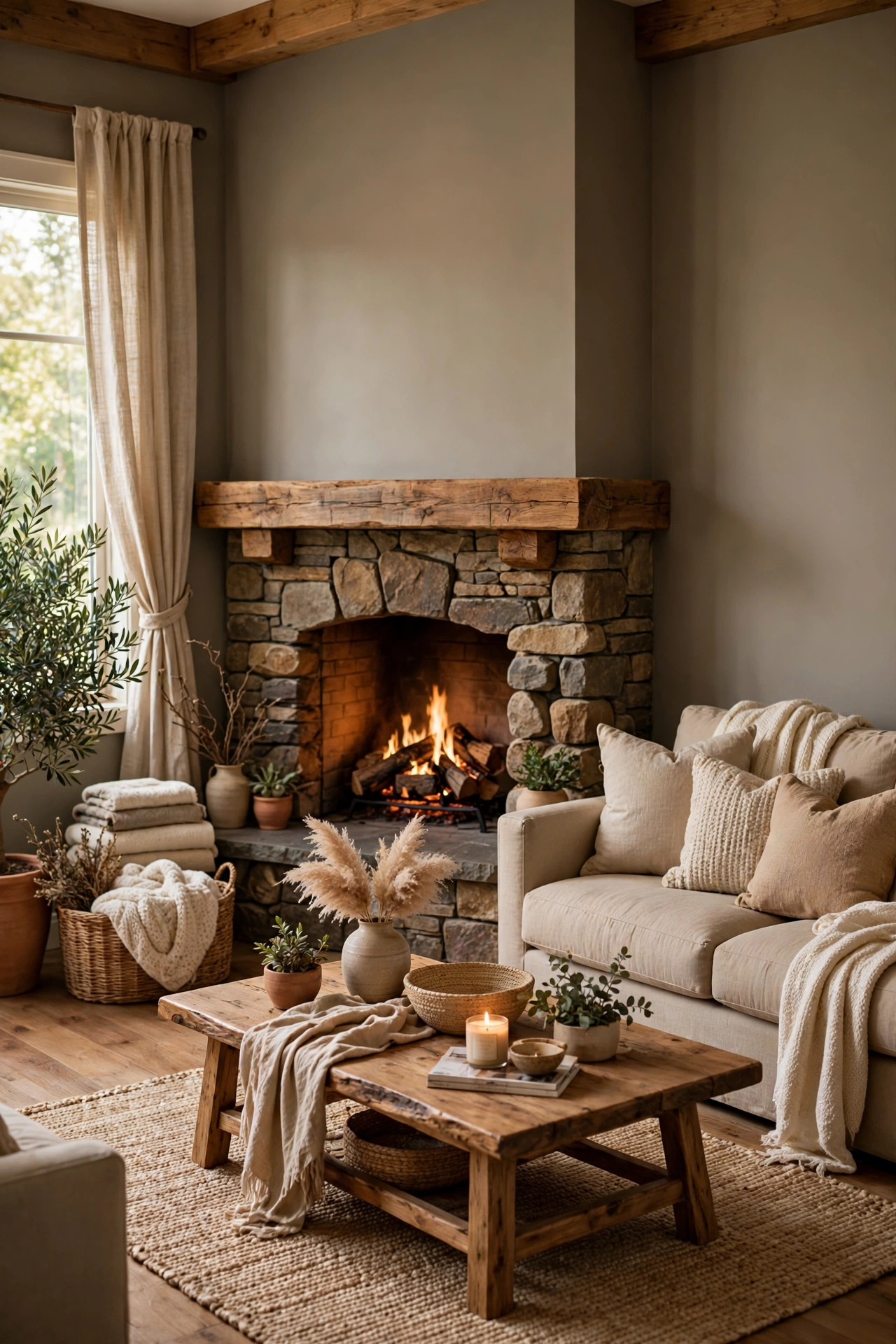
17. Worldly Gray (SW 7043): a warm greige for family rooms
Worldly Gray leans more beige than gray, with a faint green undertone that suits family rooms with stone fireplaces and warm wood. It gives walls enough presence to anchor a large room without overwhelming it, and it bridges beige furniture and gray accents in one shade. It works in rooms where you are moving away from cool grays but do not want a full beige look. Pair it with Alabaster trim and keep large pieces in muted tones. It covers well in two coats, and it holds up in rooms with mixed warm and cool light.
Try this: Sample it beside your fireplace stone, since stone pulls out the green or beige side fast.
Cost: $$| Difficulty: Easy

18. Gauntlet Gray (SW 7019): a dark warm gray for living accents
Gauntlet Gray is a dark, warm gray with greige undertones, and it suits one living room accent wall behind a sofa or fireplace. It reads lively against crisp white trim, which keeps the dark wall from feeling flat, and it pairs with warm wood and textured fabrics. Use it in rooms with good daylight or strong lamps, since dark grays need light to show their warmth. It also works on a bedroom accent wall behind the bed, where it frames the headboard. Keep the other walls pale so the accent wall stays the focus.
Try this: Paint the wall behind the largest furniture piece, since that placement grounds the dark color.
Cost: $$| Difficulty: Easy
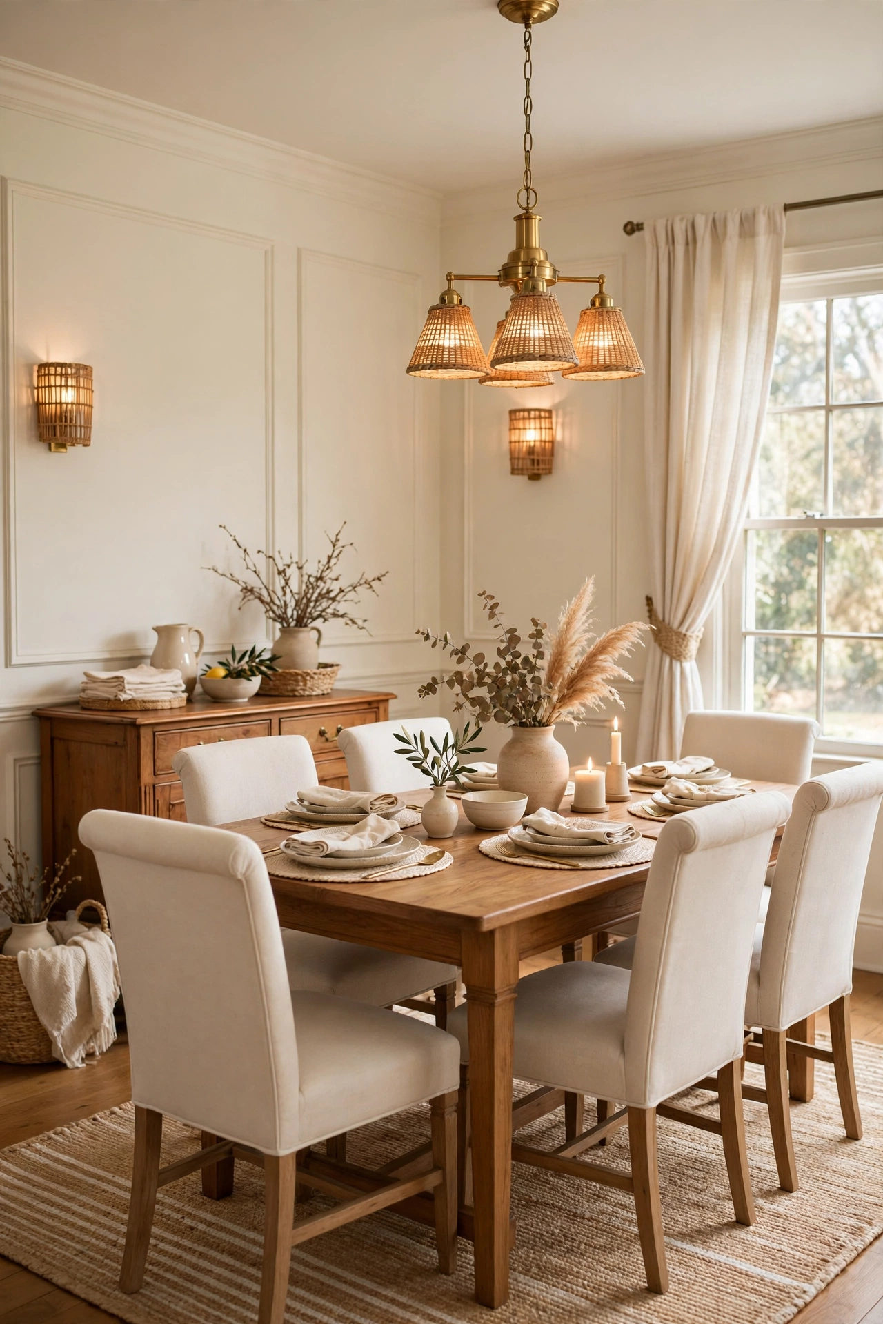
19. Dover White (SW 6385): a creamy white for traditional rooms
Dover White is a creamy warm white with clear yellow and gray undertones, and it suits traditional dining rooms and living rooms where a richer white feels right. It gives walls a soft, lived-in warmth that works with wood tables, cream chairs, and brass details. It carries more color than Alabaster or Greek Villa, so skip it on trim if you want a crisp white edge, and use it on walls only. In bright rooms it stays creamy rather than turning gold, which makes it a safe pick for south-facing spaces. Two coats over primer give an even finish.
Try this: Compare it directly with Alabaster on the same wall, since the two whites separate clearly side by side.
Cost: $$| Difficulty: Easy

20. City Loft (SW 7631): a soft taupe white for small rooms
City Loft is a warm off-white with a light taupe quality and soft pink and purple undertones, and it suits small bedrooms and studies where a plain white feels bare. It adds warmth and depth without darkening the room, and it pairs with warm whites that share its undertones plus wood with reddish tones. In some light the pink side shows more, so a sample on two walls is worth the effort before painting a whole room. It works with cream bedding and pale curtains, and it keeps a small room feeling finished rather than flat.
Try this: View the sample beside your wood furniture, since reddish wood brings out its warmest side.
Cost: $$| Difficulty: Easy
How to choose the right Sherwin Williams wall color
Start with light direction. North-facing rooms get cool light, so warm whites and beiges (Alabaster, Accessible Beige, Dover White) keep them from feeling cold. South-facing rooms get warm light, so cooler shades (Snowbound, Repose Gray, Sea Salt) hold their color instead of turning yellow. East rooms are bright in the morning and dim by evening, while west rooms flip that pattern, so check samples at both ends of the day.
Check the light reflectance value, or LRV, listed for each color. Higher numbers mean lighter paint. Pale whites sit in the 80s, mid greiges in the 50s and 60s, and dark accents like Urbane Bronze and Naval sit below 10. In a dim room, stay above 55 for all four walls and save the dark shades for one accent wall.
Buy a sample quart and paint a patch at least two feet wide on two walls, one near a window and one away from it. Live with it for two days, and look at it in morning light, midday light, and lamplight. A phone photo helps, but never choose from a screen alone, since screens shift color more than paint cards do.
Pick a finish with the room in mind. Eggshell suits most walls and wipes clean. Satin or semi-gloss suits bathrooms, kitchens, trim, and doors, where moisture and scuffs are common. Flat hides wall flaws but marks easily, so save it for low-traffic ceilings and adult bedrooms.
Plan whole-house flow before you paint room by room. Repeat one pale neutral (Alabaster, Agreeable Gray, or Drift of Mist) in halls and shared spaces, then give each room its own accent or deeper shade. That shared neutral is what makes separate room colors feel like one house.
Sherwin Williams wall colors at a glance
| Color | Undertone | Best room | Trim pairing |
|---|---|---|---|
| Alabaster (SW 7008) | Warm beige | Living room | Pure White |
| Pure White (SW 7005) | Faint warm | Bedroom | Pure White, satin |
| Snowbound (SW 7004) | Cool gray | Bathroom, kitchen | Pure White |
| Greek Villa (SW 7551) | Soft yellow | Kitchen | Greek Villa family white |
| Agreeable Gray (SW 7029) | Warm beige | Whole house | Alabaster or Pure White |
| Repose Gray (SW 7015) | Faint blue | Bedroom, office | Pure White |
| Accessible Beige (SW 7036) | Gray-beige | Open-plan living | Alabaster |
| Natural Linen (SW 9109) | Sandy greige | Bedroom, guest room | Alabaster |
| Sea Salt (SW 6204) | Green-blue gray | Bathroom | Pure White |
| Evergreen Fog (SW 9130) | Green-gray | Bedroom, office | Alabaster |
| Urbane Bronze (SW 7048) | Warm brown gray | Dining accent wall | Alabaster |
| Iron Ore (SW 7069) | Cool charcoal | Doors, accent wall | Pure White |
| Naval (SW 6244) | Cool gray navy | Office, dining room | Pure White |
| Tricorn Black (SW 6258) | True black | Library, powder room | Pure White |
| Drift of Mist (SW 9166) | Faint green gray | Hallway, low-light room | Pure White |
| Shoji White (SW 7042) | Beige-gray, faint pink | Hallway, living room | Pure White |
| Worldly Gray (SW 7043) | Warm green-beige | Family room | Alabaster |
| Gauntlet Gray (SW 7019) | Warm greige | Living accent wall | Pure White |
| Dover White (SW 6385) | Yellow-gray cream | Traditional dining room | Same-family warm white |
| City Loft (SW 7631) | Taupe, faint pink-purple | Small bedroom, study | Pure White |
Common mistakes to avoid
Skipping the sample step. A color card is small, and wall color shifts with light, floor, and furniture. A sample quart on two walls costs little and prevents a full repaint.
Painting all four walls dark in a small room. Dark shades need light and scale. In a small or dim room, keep dark colors to one accent wall and pale shades elsewhere.
Mixing whites with clashing undertones. A warm wall white beside a cool trim white makes both look wrong. Pick one white family for walls and trim, or use the named pairings in the table above.
Using flat paint in a steamy bathroom. Flat paint marks and holds moisture. Bathrooms and kitchens need satin or semi-gloss on walls near water and steam.
Painting over old paint without a lead check. Homes built before 1978 may have lead paint. The EPA lead safety guide explains how to test and what to do before sanding or scraping.
Choosing from a phone screen alone. Screens shift color with brightness settings. Use the screen to shortlist, then confirm with a real sample on your wall.
More home and wall ideas
If greige is your shortlist, compare the full family first in these best greige paint colors for every room.
For a green kitchen built around one of these wall colors, see these best olive green kitchen designs.
For a dark green bedroom that leans moody and bookish, read these charming green dark academia bedroom ideas.
In a bathroom, paint works even harder next to bead board, so look at these bead board bathroom wall ideas.
Once the walls are done, warm pieces finish the room, starting with these DIY farmhouse decor ideas.
To confirm exact shade names and codes, browse the official Sherwin Williams color tools and the Sherwin Williams curated color collections.
Frequently asked questions
What is the most elegant Sherwin Williams white?
It depends on your light. Alabaster suits warm rooms and wood floors, Pure White suits crisp bedrooms and trim, and Snowbound suits cool rooms with gray tile or marble. Sample all three on the same wall and pick the one that stays calm in your morning and evening light.
How do I test a wall color before painting the whole room?
Buy a sample quart and paint a patch at least two feet wide on two walls, one near a window and one away from it. Look at it in morning light, midday light, and lamplight over two days. That routine catches undertone shifts that a small card hides.
Which Sherwin Williams color works in a dark room?
Stay with pale shades in dark rooms. Drift of Mist, Alabaster, and Snowbound keep dim rooms open, while dark colors like Naval or Urbane Bronze belong on one accent wall at most. Add warm lamps, since pale grays can wash out under cool bulbs.
Should trim match the wall color?
Trim can match the wall color in a different sheen for a quiet, low-contrast look, or use a named white pairing for more definition. Alabaster walls pair well with Pure White trim, and dark accent walls need a crisp white trim to frame them. Avoid mixing a warm wall white with a cool trim white.
Can I use these colors in a rental?
Ask your landlord first and keep the exact color name and code for move-out. Pale neutrals like Agreeable Gray and Alabaster are the easiest to get approved, and they are also the easiest to repaint if the lease asks for the original color back.
Final thoughts
Start with one room, one sample, and one named trim white, and let the light in that room make the final call. The shades in this guide earned their place because they stay calm across different homes, and the right one for your walls is the one that still looks right at night under your own lamps.


